Design Principles: Exercises and Projects

27/08/18 - 29/11/18 (Week 1 - Week 14)
Jasmine Teoh Lee Suan (0331993)
Design Principles
Exercises & Projects
Instructions:
Exercises
Lecture 1: Contrast
27/08/18 - 3/9/18 (Week 1)
Today is our first day of lectures, and also our first Design Principles class. After getting to know our lecturers, Miss Sherry and Miss Anis, we were given a short briefing on the course outline through the Module Information Booklet. Miss Sherry then proceeded to give us all a short lecture on Contrast.
Contrast:
Definition - The state of being strikingly different from something else in juxtaposition or close association.
- When two or more elements in a page show difference between each other
- Can be achieved by putting two strongly opposing elements together
- Aspects such as color, shape, size, direction can be used to manipulate contrast in a composition
What I understood about contrast is that it shows difference and uniqueness in your composition. Rather than repetitive and symmetrical patterns and designs, contrast adds more spice to the design, making it really eye catching and interesting to look at.
Miss Sherry then showed us some examples of contrast on book covers by famous designers, to let us grasp the concept of contrast and understand it easier. I particularly thought that the "The Boomer" book cover was really interesting and it made me want to read the book (which I unfortunately have no idea where to find it :().

Examples of Contrast on Book Covers
|
She also showed us different types of contrast, and how to obtain these different ways of showing contrast. I really like using color to define contrast, therefore these designs appealed to me a lot.
 |
A red safety ring among all the blue safety rings.
|
 |
The green goldfish shows a lot of contrast when put with all the orange goldfish. Other than colour, contrast was shown through the direction of the fish as well.
|
I also searched for information about contrast after the lecture, and found the contrast in these pictures really interesting.
 |
Four pigs, only one of them is a hairy pig.
|
 |
Yin and yang, with contrast between the negative and positive space.
|
 |
A man feeding some ducks at a lake. I like how the ground and water show a huge contrast between each other.
|

A cat drawn on a black background using white strokes. Not every detail was drawn but the contrast of the strokes showed the highlights and contours of the cat.
|
These are the notes that I took during the lecture:
 |
Lecture notes taken in class.
|
Exercise 1:
Tools and Materials - Pens, pencils and markers, A4 paper.
Description - Create a composition that contains contrast in it, restricted to using only black and white.
I went home and decided to draw some sketches and ideas that came to my mind on my pocket-sized black papered notebook. I used a white colored pencil to draw these sketches.
 |
Initial Ideas of Contrast Composition Drawn on Black Paper Sketchbook
|
After sketching, I then proceeded to choose the designs that appealed the most to me. With markers, pens and some black ink, I created the design on A4 drawing papers and sketchbook papers. These are the results of my work:

Contrast Exercise 1: Kitten with the Shadow of a Lion

|
 |
Contrast Exercise 3: Inkscream
|
 |
Contrast Exercise 4: Ojjang
I tried drawing the shape of the cat out without actually drawing every single stroke, and I think it turned out not bad. I also put the dog bones in the background because I felt that the background lacked something before. And also because the dog bones go against the fact that it's a cat in the picture. |

Contrast Exercise 5 (Final): Nurtured Tree
I went with the concept of a beautiful tree that wouldn't have turned out this beautiful without the love and care of the hands that nurtured it. I wanted to deliver the message of always remembering your roots and who helped you accomplish your goals in life to the public. I used messier lines and strokes for the texture of the tree bark, while drew the hands with really clean lines. I also played around with the black and white colors and spaces of this artwork. I think that this piece showed the most contrast and meaning among all my pieces, therefore I chose it as my final artwork.
Feedback:
We had a critique session during class and I presented the cat and the trees and hands to everyone. Miss Sherry said that both my artworks showed a lot of contrast. For the cat, she really liked how I didn't draw every stroke of the cat and instead used the lines to define its body shape. She also commented that the dog bones behind formed patterns, adding on that she thought the cat was a really fierce one. As for my final artwork, the trees and hands, she really liked how I used two different ways of creating the two different objects, yet it had some sort of relation to it. She liked how I drew the hands, they symbolized the roots of the tree. She also said that the tree was stylized as it didn't look exactly like a real tree, and that it was cool. I'm happy to know that she liked my artwork.
We had a critique session during class and I presented the cat and the trees and hands to everyone. Miss Sherry said that both my artworks showed a lot of contrast. For the cat, she really liked how I didn't draw every stroke of the cat and instead used the lines to define its body shape. She also commented that the dog bones behind formed patterns, adding on that she thought the cat was a really fierce one. As for my final artwork, the trees and hands, she really liked how I used two different ways of creating the two different objects, yet it had some sort of relation to it. She liked how I drew the hands, they symbolized the roots of the tree. She also said that the tree was stylized as it didn't look exactly like a real tree, and that it was cool. I'm happy to know that she liked my artwork.
Lecture 2: Gestalt Principle
3/09/18 - 10/9/18 (Week 2)
For this week's lecture, we were introduced to the Gestalt Principle. I've never heard of the word Gestalt before, so I searched for the the meaning of it on Google as soon as I heard it.
Definition - An organized whole that is perceived as more than the sum of its parts.
From what I understand, gestalt is a principle that focuses on the unified whole of an image. Your brain and eyes have to work together to get the image. I think that it's a really cool principle and designers who use gestalt in their designs well are really creative.
 |
Gestalt Principle
|
There are a few types of Gestalt Principles that you can apply and inscribe into your design, namely:
1) Similarity:
- Objects that are similar are beside each other
- Unity occurs, can be seen as one when they're placed beside each other
- This is because humans require order, and when there is order, unity happens
 |
Triangles arranged in a circle to represent a sun.
|
2) Continuation:
- The eye moves from one object to another through the flow of the design
 |
The leaf moves along with the wind through the pillars, to me it looks like the letter 'H'.
|
3) Closure:
- When an object is incomplete or not completely enclosed
- How much of the project can be left out and can still be seen is what makes closure
 |
The outline of the star is not drawn out, but defined by the other shapes around it.
|
 |
The outline of this Dalmatian isn't drawn out either, but we can still recognize that it's a Dalmatian because of the spots forming its outer form.
|
4) Proximity:
- When objects are placed together, the eye sees them as a group
- Objects have to be placed closely for proximity to be shown
 |
A spiral formed through the arrangement of squares.
|
 |
The arrangement and proximity of circles display an eye.
|
5) Figure-ground perception
- Two objects or elements that compliment each other
- Formed together into a design
- Doesn't show both the objects immediately, you have to think about it and use your brain to spot the other object
 |
Examples of figure-ground perception in designs.
|
 |
A shoe with the Nike logo on it.
|
 |
Summary of the Gestalt Principles.
|
I felt that I didn't really understand much about Gestalt during the first time Miss Sherry gave us the lecture, so I asked if she could explain more and reiterate the principles to us. After the second time, I think I understand more about it, and I think that the figure and ground perception is really amazing.
Notes that I took during the lecture:


Lecture notes for Gestalt.
Exercise 2:
Tools and Materials - Black and White Paper, Cutter, Scissors, Glue
Description - By applying the Gestalt Principle in your work, create a design by cutting out the shapes using black and white paper only.
We were given time to do this exercise in class, and I had no inspiration at that time. I scrolled through some images in my own gallery for inspiration, and found an image that gave me ideas for gestalt. It's actually a scene from a music video that I really liked, and from those figures in the image, I thought of turning the space outside of the figures into letters as the space outside the first figure looked like a 'P' to me at that moment.
 |
NCT Dream's We Go Up music video gave me inspiration for my gestalt exercise design.
|
I started sketching the draft of my design and slowly the whole composition started to form (magically haha).
 |
| Rough Draft |
What I wanted to show was the different ways of how people interpret partying on the white space, and the actually word 'PARTY' on the black space. I think that it was a really hard and ambitious thing to do, as it wasn't easy for me to put both together that easily, especially for the T and Y symbol. Maybe if I spent more time thinking about the design I would've gotten a better way to show the last two letters (but I still think of it till today and I still can't think of a better way yet, oops).
Here's the result of my Gestalt artwork:
 |
| Final Artwork: Gestalt Principle |
I drew on the image digitally to point out the word 'PARTY' in case anyone couldn't grasp the image properly too:
 |
| Drawn Image |
Feedback: Miss Anis said that my design wasn't quite there, and that it looked too complicated and messy for her to be able to see the PARTY word. I was honestly a little sad because I spent a lot of time thinking of how to get the party word to cooperate with the silhouettes, but I'm glad I could listen to the opinions that make me rethink my design and give me motivation to better it. Miss Sherry on the other hand, was trying her best to figure out what the gestalt in there was and after pointing the party word to her she was like 'OHHHHH I see it now!' and told me she'd give me credit for this because it wasn't an easy feat to accomplish. I felt happy that my design was appreciated.
After receiving feedback, I decided to give another attempt at Gestalt and made another composition. This time, I got my inspiration from scrolling through my Twitter library and found that the right part of the picture below looked like a tree trunk (idk how but it just looked like that at that time so yeah HAHA).
 |
GIDLE's Yuqi.
|
I sketched out my initial idea and started refining the details as I cut the black paper out to fit the shape of my design.
 |
| Rough Draft |
The idea of Gestalt in this piece is that you can see a tree with branches and a bird's nest, alongside a giant flower with leaves and grass at the bottom, but it can be seen as a girl's face, the hair, eyes, nose and mouth as well. I wanted to express what I thought about natural beauty through this, with the nature and the face blending in with each other. Here's how the final results look like:
 |
| Final Artwork (2): Gestalt Principle |
Feedback:
Miss Sherry said that I've grasped the idea of gestalt, and did well trying to attempt different things. She was surprised that I made the second one with way more detail than the first. She also commented that it was a unique way of expressing gestalt and that the girl's face looks a little scary.
I'm finally done with all these Gestalt stuff wheeee~
Written Assignment 1: Research and write about a designer in South East Asia
As there was a holiday during one of our classes this week, we were instructed to work on a writing assignment instead. The assignment was about looking up on a designer from South East Asia and writing about him/her. I honestly had very little knowledge about designers from this region, so I felt that this was a really helpful assignment to broaden our minds on the different cultures that affect different designs.
I spent a lot of time searching for a designer that I wanted to write about, I found this woman from Thailand who did art in video form but I felt like she was more of an artist than designer so I scratched that. I also found this guy from Malaysia who works at PIXAR but I feel like he doesn't show much of South East Asian design originality so I scratched that too.
Later on, I stumbled upon this guy who designed his own cartoons and animations but also did freelance illustrations, and he was from my own country, Malaysia, as well. I decided to write about him in the end. Feel free to read about him in the link below!
 |
| Notes about Assignment 1 |
Lecture 3:
Symmetry, Asymmetry, Balance & Emphasis
10/09/18 - 18/9/18 (Week 3)
Starting this week, our classmates will be taking turns giving the lectures through presentation slides, instead of the lecturers themselves. I think that it's a really helpful way of getting to know each topic as we have to do our research by ourselves before presenting to the class. I like how our classmates share the slides they made to the group so that we can reference it later on as well.
Today's topic was about Symmetry, Asymmetry, Balance & Emphasis.
Here are the descriptions of each point and some examples of designs that contain these elements:
1) Symmetry:
- There are three types of symmetry: Reflectional, rotational and translational symmetry
- Contains a symmetry line to refer to
- Rotational symmetry is where the elements rotate around the common centre
- Basically, the designs look very symmetrical and same no matter which way you look at it, sometimes it is thought of as boring
 |
Symmetrical shapes with symmetry lines.
|
 |
Example of design that contains symmetry. The two monkeys are reflected upon the symmetry line.
|
2) Asymmetry:
- The opposite of symmetry, it is not symmetrical on both sides at all
- Achieved by distributing the elements so that it looks balanced on both sides even though it is not similar at all
- More interesting, unique design
 |
A leaf that is positioned asymmetrically in the composition.
|
 |
Example of an asymmetrical design. I really like this design as there are so many things going on and it looks really abstract even though it's very geometrical.
|
 | |
Difference between a symmetrical design and an asymmetrical design.
|
3) Balance:
- Three types of balance: Formal, Informal and Radial Balance
- How you arrange the elements in a composition to make it look equal
- Looks pleasing to the eye, everything is placed so that the eye can capture it all through the flow.
 |
Types of balance.
|
 |
Design containing balance.
|
4) Dominance / Emphasis:
- One specific element in the design takes control of the viewer's attention
- Created with different elements like colour, shape, size and texture
- Often confused with contrast, Emphasis is where one thing stands out and is emphasized among the rest of the elements in the design
 |
Examples of emphasis
|
 |
Design containing the emphasis element. Size and color are two factors that created the emphasis in here.
|
Notes that I took during the lecture:
 |
| Lecture notes taken in class. |
Exercise 3:
Tools and Materials - Watercolor and A4 Paper
Description: Choose between one of the four aspects, Symmetry, Asymmetry, Balance & Emphasis, and create a composition / artwork based on that aspect using watercolors only.
I drew some sketches on my sketch book as soon as we got the assignment, but nothing seemed interesting for me to work on.
I drew some sketches on my sketch book as soon as we got the assignment, but nothing seemed interesting for me to work on.
 |
| Sketch 1 |
 |
| Sketch 2 |
I decided to work on Emphasis / Dominance for my artwork this time. As my birthday had just passed recently, I went for a buffet dinner at PJ Hilton and saw the place decorated with flower bouquets for some dinner for junior national football teams (I think). I was observing the flowers and thought that they all were decorated with balance in color (kudos to the florist). I then decided that I could make my own flower bouquet with more emphasis into it.
I wanted to to paint a rose bouquet with red roses surrounding a blue rose in the center of the bouquet. I'm not a professional at watercolors, so I had to look up on how to watercolor roses on YouTube (https://www.youtube.com/watch?v=_x5AY36QIog). I also looked at roses a lot in general.
 |
Reference image of how rose bouquets look like.
|
 | |
A blue rose among red roses. I had to refer to this image for the colour and hue of the roses. I felt that getting the wrong blue would defeat the emphasis in the painting.
|
 |
| Watercolor ideas. |
 |
| Rough paper to test out the colours. |
 |
| Final Artwork: The Blue Among Red |
Here's the result of my final artwork. I added a girl holding the bouquet as if she was the bridesmaid of a wedding, to make the composition look more interesting. I also didn't plan it at first but the composition looked more symmetrical that I had expected, with a few asymmetrical details here and there. I wanted to express the emphasis on the blue rose among the red roses as a metaphor to how everyone follows fashion trends which then leads to the whole street of people end up wearing similar clothes, with the exception of a few people that have their own style and stand out more compared to the others.
Feedback:
Miss Sherry said that it was a nice painting that showed symmetry in the composition, with the black shadow and the flower stalks having a little asymmetrical value in it. She also said that the blue rose definitely stands out among the red roses and showed emphasis. What made me really happy was that she commented on my watercolor skills and said that I got the highlights and shadows for the arms very well done, and gave a nice texture to the dress.
Miss Sherry said that it was a nice painting that showed symmetry in the composition, with the black shadow and the flower stalks having a little asymmetrical value in it. She also said that the blue rose definitely stands out among the red roses and showed emphasis. What made me really happy was that she commented on my watercolor skills and said that I got the highlights and shadows for the arms very well done, and gave a nice texture to the dress.
Lecture 4: Texture, Repetition, Surface & Pattern
18/09/18 - 25/9/18 (Week 4)
On today's lecture, our classmates covered Texture, Repetition, Surface & Pattern. They talked about pattern first, before moving off to the other points. Here are some explanations and examples of the four design principles:
1) Pattern:
- underlying structure that organizes surfaces or structures in a consistent, regular manner
- a repeating unit of shape or form
- the "skeleton" that organizes the parts of a composition
 |
| Flowing Pattern |
 |
| Branching Pattern |
 | |
| Spiraling Pattern |
 |
| Cracking and Patching Pattern |
2) Repetition:
- allows for a single point to be repeated numerous times throughout
 |
| Repetition |
3) Texture:
- the perceived surface quality of a work of art
- element two-dimensional and three-dimensional designs and is distinguished by its perceived visual and physical properties
- can convey a variety of messages and emotions
 |
| Texture |
4) Surface:
- the top layer of the object
- what we see in 2D
- identifies an object
 |
| Surface |
Exercise 4:
Tools and materials - Aluminum foil, sponges, poster colours, A4 black paper, brushes, fingers
Description - Create a composition containing Texture, Repetition, Surface & Pattern using stamping method, with different kinds of materials you can find.
As I did printmaking in my foundation year, I wanted to try something a little bit different from cutting out the shape that I wanted on a piece of solid, and decided to let the shapes of the tools that I found guide me instead. I also wanted to try out different types of tools that produce different types of textures, to create more variety and depth in my design.
I did some tryouts with the tools that I found and selected on black A4 paper, so that I could know which tool would produced what kind of texture and shape. I used white, gold and silver poster colours because I thought that they would stand out the most on a black sheet of paper.
Here are the tools that I used to create my patterns and textures:
After that, I started working on my designs based on my knowledge from the lecture and the experience I gained during the testing of my tools. I researched a little bit more and looked at references for stamping with patterns and textures.
I then decided on my composition and wanted to create the back of an artist (the performing kind) because usually people only focus on the front of the artists when they perform. I wanted to create a textured feel to the artist's clothes, and create depth and space therefore I used the sponges to create a blurry lighting effect and my fingers to create a bokeh effect as the lighting on stage (reference below). I found out that I could control the pressure of stamping to create a different opacity to control the shadows and highlights on the figure's clothes.
Here's the bokeh reference:
I tried out my second attempt on Texture, Repetition, Surface & Pattern and focused more on making the whole composition a pattern that contained textures. As I was eating a really expensive Korean peach gifted by my aunt (I was sooooo happy to see it in the fridge I swear the last time I had such a good peach was in Korea), I decided to focus my subject on that as I could relate it to the shape of the aluminum foil that I used. As I was eating it on my table which had a cutting mat on it, I decided to inscribe the squarish checkered pattern into the design as well, as a table cloth to the peaches on the table. I then proceeded to create my artwork by filling the surface of the sponges with paint, and aligned each stamp properly so that it would look neat and symmetrical.
The only thing I couldn't control well was the pressure and texture shown on the paper as each time I stamped, the pressure and density of the paint would change. I liked how it turned out though, to me it looked more interesting to have different textures than a same print of the same thing over again. It created a sense of depth as well. For the peaches, I used the aluminum foil with gold paint and each peach looked different as well because not all peaches would look the same. As I thought that the artwork was missing something, I decided to add one more element, the cream on the peaches. I used a paint brush and silver paint to stamp onto the peach and created a strike through the gold ball. I decided to leave empty black space around the peach to keep the composition neat. Overall I really liked the outcome, it looked abstract and it was the first time I made something so neat (HAHAHAHA).
As I did printmaking in my foundation year, I wanted to try something a little bit different from cutting out the shape that I wanted on a piece of solid, and decided to let the shapes of the tools that I found guide me instead. I also wanted to try out different types of tools that produce different types of textures, to create more variety and depth in my design.
 |
| Sketches and Ideas |
I did some tryouts with the tools that I found and selected on black A4 paper, so that I could know which tool would produced what kind of texture and shape. I used white, gold and silver poster colours because I thought that they would stand out the most on a black sheet of paper.
 |
| Sponge and Paintbrush |
 |
| Hard Sponge and Soft Sponge |
 |
| Fingers, paintbrush, aluminum foil |
 |
| Soft Sponge with diluted paint |
 |
| Fingers and Aluminum Foil |
Here are the tools that I used to create my patterns and textures:
 |
| Tools that I used |
After that, I started working on my designs based on my knowledge from the lecture and the experience I gained during the testing of my tools. I researched a little bit more and looked at references for stamping with patterns and textures.
 |
| Pattern Stamping Reference 1 |
 |
| Pattern Stamping Reference2 |
 |
| Pattern Stamping Reference3 |
I then decided on my composition and wanted to create the back of an artist (the performing kind) because usually people only focus on the front of the artists when they perform. I wanted to create a textured feel to the artist's clothes, and create depth and space therefore I used the sponges to create a blurry lighting effect and my fingers to create a bokeh effect as the lighting on stage (reference below). I found out that I could control the pressure of stamping to create a different opacity to control the shadows and highlights on the figure's clothes.
 |
| Final Artwork: Back to the Spotlight |
Here's the bokeh reference:
 |
| Bokeh |
I wasn't totally satisfied with handing this in as my final artwork as I questioned myself if there were enough design principles shown in my artwork or whether it was strong enough. And I felt that I didn't grasp the idea of patterns too well in that piece, I think that it looked artistic but a bit too messy for patterns to be seen clearly, even though I liked the feel, I think I could refine it a bit more or try a second attempt on it. I decided to work on that if I had extra time, in the meanwhile I tried out something that was quite different from my first attempt.
 |
| Final Artwork: Peaches and Cream |
I tried out my second attempt on Texture, Repetition, Surface & Pattern and focused more on making the whole composition a pattern that contained textures. As I was eating a really expensive Korean peach gifted by my aunt (I was sooooo happy to see it in the fridge I swear the last time I had such a good peach was in Korea), I decided to focus my subject on that as I could relate it to the shape of the aluminum foil that I used. As I was eating it on my table which had a cutting mat on it, I decided to inscribe the squarish checkered pattern into the design as well, as a table cloth to the peaches on the table. I then proceeded to create my artwork by filling the surface of the sponges with paint, and aligned each stamp properly so that it would look neat and symmetrical.
The only thing I couldn't control well was the pressure and texture shown on the paper as each time I stamped, the pressure and density of the paint would change. I liked how it turned out though, to me it looked more interesting to have different textures than a same print of the same thing over again. It created a sense of depth as well. For the peaches, I used the aluminum foil with gold paint and each peach looked different as well because not all peaches would look the same. As I thought that the artwork was missing something, I decided to add one more element, the cream on the peaches. I used a paint brush and silver paint to stamp onto the peach and created a strike through the gold ball. I decided to leave empty black space around the peach to keep the composition neat. Overall I really liked the outcome, it looked abstract and it was the first time I made something so neat (HAHAHAHA).
Feedback:
Miss Sherry liked the peaches and cream final artwork more than the first attempt I made, good taste Miss Sherry! :') She was happy with how I used different tools to create different textures and shapes. The lecturers liked how I used a black background with gold and silver paint instead of a white piece of paper.
Lecture 5: Alignment, Hierarchy, Placement, Direction
25/09/18 - 2/10/18 (Week 5)
Today our classmates presented the design principles Alignment, Hierarchy, Placement and Direction to us, and I found their slides really interesting because they used it to represent the design principles themselves. The only thing I wish they did was to teach us about the alignment in graphics instead of typography. Here are some notes about alignment and research that I did myself because I didn't really understand this topic.
1) Alignment
a) Edge Alignment
b) Centre Alignment
c) Visual / Optical Alignment

3) Placement
4) Direction
a) Horizontal Direction - Makes things calm and stable
b) Vertical Direction - Makes things balanced
c) Diagonal Direction - Suggests movement and action
1) Alignment
 |
| Alignment |
a) Edge Alignment
- determines the arrangement of elements in relation to the edges of the page
 |
| Edge Alignment |
b) Centre Alignment
- elements are aligned to the centre of the page
- centered with other elements on page
- centered horizontally, vertically or both
 |
| Centre Alignment |
c) Visual / Optical Alignment
- visually aligned to accommodate swooping curves of v
- some designers break alignment to make something stand out more

2) Hierarchy
- Arrangement of presentation of elements to signify importance
Different ways of implying Hierarchy:
- Scale - to make things stand out
- Colour and Contrast - different colour from the surface catches attention
- White space
- Proximity - Nearness to an eye catching element
 |
| Different ways to inscribe Hierarchy in Design |
 |
| Examples of Hierarchy in Designs |
3) Placement
- changes and position of shapes or objects that affect the composition
- Placement on paper - objects places higher within the picture plane will appear farther away
 |
| Examples of Placement in Designs |
4) Direction
a) Horizontal Direction - Makes things calm and stable
 |
| Horizontal Direction |
b) Vertical Direction - Makes things balanced
 |
| Vertical Direction |
c) Diagonal Direction - Suggests movement and action
 |
| Diagonal Direction |
Exercise 5:
Tools and materials - Newspaper, magazines, paper, glue, scissors, cutter
Description - Gather images and elements from newspapers, magazines, flyers or printouts and create a collage based on the design principles discussed for the week.
For class today, Miss Sherry wanted us to go around the university to sketch something in our notebooks for 30 minutes. I found my old bear sculpture that I did in my foundation year and sketched it. I like sketching the outlines and contours of the silhouette roughly instead of going into detail, I think it's a more appealing way to me.
For our collage exercise, we were to make collages with newspapers, magazines, cutouts, printouts and other materials. We could also include a bit of penning if we wanted to.
I sketched out some ideas related to the design principles that we were working with (Alignment, Hierarchy, Direction and Placement) so that I don't go out of track when creating my collage and its composition.
I then started flipping through the magazines and newspapers that I prepared to search for elements that could be used in my collage. I noticed that most of the designs of my collages depended on the elements that I found from the materials, and I expanded the ideas and concepts of my designs through those elements.
After that, I attempted to place my elements onto a piece of A4 paper, without sticking it. From here onward, I had quite a bit of difficulty in thinking about the placing of my elements and how to make it look nice. I was so scared of gluing the cutouts and finalizing their positions. Therefore I decided to take pictures of it so that I could keep my initial ideas documented.
I told myself that I had to come up with a finalized design and that designers need to make decisions anyways, so instead of thinking and thinking, I just decided to make a composition based on the elements.
For this piece, I started off by finding the green mountains and the backpacker. He looked really free and like there was a whole new world to explore out there. After that, I found the guy up front, he was holding a laptop and he looked like his whole life was being controlled by it (to me at least, and I fear that many of us would be like him in the future too). I decided to place the guy with the laptop in front as I thought he was more important and that it would create a sense of depth between the two humans. I then thought more about the alignment and wanted to create a minimalist design, so I cut out strips that reflected the colour of the bottom part. I added a quote "route to freedom' behind those strips because I didn't want that to be too visible and more hidden. I also cut a mountain out after and added clouds to look sceneric. Basically I wanted to express that society now gets controlled over technology and people should appreciate the freedom of nature more.
For this piece, I decided on the alignment first. I gave it a right alignment then made a border with the elements I wanted to use. I wanted this piece to express vintage and modern in the same page, focusing on mostly yellow and grayscale as the colour theme. The new and exclusive words were blue, which I think contrasted and stood out well among all that yellow and grey. As for the elements used, I decided to tear the portraits to get a textured edge, to make those parts look more vintage. The main concept of this was about the kid flipping through a book and one of the pages contained historical figures and a modern figure, and even though the modern figure is new, the historical ones are still more exclusive, and we should treasure the history that was made. As for the 1-0, I wanted it to mean 1 win for history to modern.
Honestly, I wasn't really pleased with both of these artworks, and decided to refer to more collages and get used to the style of collages.Here are some references that gave me more ideas on how placement worked.
I then started working on my final artwork.
What I learnt from this exercise was that it wasn't as easy as I thought, especially when I had to think of the placement of the objects. I've done a bit of collaging before, but I think I focused too much on the design principles that I had to work with and therefore thought that creating the composition was not as free as it usually would be. I honestly felt like I had the most difficulty with this exercise compared to the previous few, probably because I didn't really know how to express alignment, hierarchy and placement at first. But I think that as I continued looking at references, I started to understand the principles more.
AND AN EXTRA DISCOVERY:
For class today, Miss Sherry wanted us to go around the university to sketch something in our notebooks for 30 minutes. I found my old bear sculpture that I did in my foundation year and sketched it. I like sketching the outlines and contours of the silhouette roughly instead of going into detail, I think it's a more appealing way to me.
 |
| Bear Sculpture Sketch |
 |
| Sketch of tables outside the lecture halls using pen |
For our collage exercise, we were to make collages with newspapers, magazines, cutouts, printouts and other materials. We could also include a bit of penning if we wanted to.
I sketched out some ideas related to the design principles that we were working with (Alignment, Hierarchy, Direction and Placement) so that I don't go out of track when creating my collage and its composition.
 |
| Initial ideas and compositions of collage according to the design principles related to this exercise |
I then started flipping through the magazines and newspapers that I prepared to search for elements that could be used in my collage. I noticed that most of the designs of my collages depended on the elements that I found from the materials, and I expanded the ideas and concepts of my designs through those elements.
After that, I attempted to place my elements onto a piece of A4 paper, without sticking it. From here onward, I had quite a bit of difficulty in thinking about the placing of my elements and how to make it look nice. I was so scared of gluing the cutouts and finalizing their positions. Therefore I decided to take pictures of it so that I could keep my initial ideas documented.
 |
| First attempt of arranging the cutouts into a collage |
I told myself that I had to come up with a finalized design and that designers need to make decisions anyways, so instead of thinking and thinking, I just decided to make a composition based on the elements.
 |
| Exercise 5 - Collage (1st Attempt) |
For this piece, I started off by finding the green mountains and the backpacker. He looked really free and like there was a whole new world to explore out there. After that, I found the guy up front, he was holding a laptop and he looked like his whole life was being controlled by it (to me at least, and I fear that many of us would be like him in the future too). I decided to place the guy with the laptop in front as I thought he was more important and that it would create a sense of depth between the two humans. I then thought more about the alignment and wanted to create a minimalist design, so I cut out strips that reflected the colour of the bottom part. I added a quote "route to freedom' behind those strips because I didn't want that to be too visible and more hidden. I also cut a mountain out after and added clouds to look sceneric. Basically I wanted to express that society now gets controlled over technology and people should appreciate the freedom of nature more.
 |
| Exercise 5 - Collage (2nd Attempt) |
For this piece, I decided on the alignment first. I gave it a right alignment then made a border with the elements I wanted to use. I wanted this piece to express vintage and modern in the same page, focusing on mostly yellow and grayscale as the colour theme. The new and exclusive words were blue, which I think contrasted and stood out well among all that yellow and grey. As for the elements used, I decided to tear the portraits to get a textured edge, to make those parts look more vintage. The main concept of this was about the kid flipping through a book and one of the pages contained historical figures and a modern figure, and even though the modern figure is new, the historical ones are still more exclusive, and we should treasure the history that was made. As for the 1-0, I wanted it to mean 1 win for history to modern.
Honestly, I wasn't really pleased with both of these artworks, and decided to refer to more collages and get used to the style of collages.Here are some references that gave me more ideas on how placement worked.
 |
| Collage Reference (1) |
 |
| Collage Reference (2) |
 |
| Collage Reference (3) |
I then started working on my final artwork.
 |
| Process of creating my final artwork |
 |
| Exercise 5 - Final Artwork: Collage |
What I learnt from this exercise was that it wasn't as easy as I thought, especially when I had to think of the placement of the objects. I've done a bit of collaging before, but I think I focused too much on the design principles that I had to work with and therefore thought that creating the composition was not as free as it usually would be. I honestly felt like I had the most difficulty with this exercise compared to the previous few, probably because I didn't really know how to express alignment, hierarchy and placement at first. But I think that as I continued looking at references, I started to understand the principles more.
AND AN EXTRA DISCOVERY:
 |
| I found gestalt while doing this exercise! |
If you look at this image, it's of a horse, but if you turn it upside down, it looks like a woman holding onto the reigns of a horse that she's riding. Funny that we encounter all these other design principles while working on one of them, I realize that everything somehow connects with each other in the end.
Feedback:
I only got feedback for my first attempt as I haven't showed the lecturers my final attempt in real life, and Miss Sherry said that my first attempt was really minimalism. I forgot the rest of the feedback that she gave because in all honesty I wasn't very keen on the outcome of that artwork myself. I like my final artwork way more, though!
Lecture 6: Dots, Lines, Scale, Size
2/10/18 - 9/10/18 (Week 6)
For this week's lecture, my friends and I presented in front of class. These are the slides that we made for our presentation about Dots, Lines, Scale, and Size.
For this week's lecture, my friends and I presented in front of class. These are the slides that we made for our presentation about Dots, Lines, Scale, and Size.
 |
| Dots |
 |
| Dots |
 |
| Lines |
 |
| Size and Scale |
 |
| Scale and Conclusion |
Exercise 6:
Tools and materials - Mixed Media, A4 Paper
Description - Create a composition based on Lines, Dots, Scale and Size using any type of media that you've used so far.
In class, we did sketching again. This time we were told to choose one of our classmate's shoes and draw it. I had fun sketching Debbie's shoe especially the part with the ribbon laces. It's been a long time since I was serious at sketching something so it felt nostalgic haha.
I also tried one-line-art, which meant drawing something without lifting the pencil in one line. And yeah, this is is how it turned out. orz
I then proceeded to work on my final artwork. I decided that I would create an artwork based on places that I've been which showed a lot of lines, dots and scaling in it. They're also places that left great memories for me. I would like to write all about them here but it would be super long so hit me up if you want to know the story behind each place that I chose. :D Anyway, here are the sketches that I have made:
After sketching, I learned that dots, scale and size were also applied in the sketches, along with other design principles. I also understood more about the different types of lines, for example I used really neat and straight lines in the first sketch, which made the whole sketch seem neat and tidy and architectural, while I sketched the jetty using rough and overlapping lines, which created a messier feeling to my sketch. I also noticed the difference between thin and thick lines and the type of tools used to draw lines, while drawing with a pencil, the lines look softer and more fragile, as compared with drawing with a pen which made the lines look more bold and solid.
I then used the knowledge gained after sketching the four sketches to create my final artwork.
In class, we did sketching again. This time we were told to choose one of our classmate's shoes and draw it. I had fun sketching Debbie's shoe especially the part with the ribbon laces. It's been a long time since I was serious at sketching something so it felt nostalgic haha.
 |
| Sketch of classmate's shoe done in class |
For this week's exercise, I started off by randomly sketching stuff with the idea of different lines and dots in mind. I originally wanted to connect lines, dots, scale and size somehow to create a techno or old tombstone ruin kind of design, but I decided to turn to something closer to me so that my feelings would be conveyed into my art better.
 |
| Random sketches for this exercise |
 |
| Sketches for this exercise |
I also tried one-line-art, which meant drawing something without lifting the pencil in one line. And yeah, this is is how it turned out. orz
 |
| One-Line art of a random person in campus |
I then proceeded to work on my final artwork. I decided that I would create an artwork based on places that I've been which showed a lot of lines, dots and scaling in it. They're also places that left great memories for me. I would like to write all about them here but it would be super long so hit me up if you want to know the story behind each place that I chose. :D Anyway, here are the sketches that I have made:
 |
| Sketch of Sunway Pyramid's outer building |
 |
| Sketch of the inside of Sunway Pyramid |
 |
| Sketch of KLCC |
 |
| Sketch of a Jetty in Penang |
After sketching, I learned that dots, scale and size were also applied in the sketches, along with other design principles. I also understood more about the different types of lines, for example I used really neat and straight lines in the first sketch, which made the whole sketch seem neat and tidy and architectural, while I sketched the jetty using rough and overlapping lines, which created a messier feeling to my sketch. I also noticed the difference between thin and thick lines and the type of tools used to draw lines, while drawing with a pencil, the lines look softer and more fragile, as compared with drawing with a pen which made the lines look more bold and solid.
I then used the knowledge gained after sketching the four sketches to create my final artwork.
 |
| Exercise 6: Final Artwork - Ikea in Australia |
I chose this artwork as my final artwork as I thought that it represented the design principles we were working on the best, and also because it appealed to me the most. I used different types and thickness of lines to compose this piece of artwork, as the chairs get deeper into the back, the lines I used had way less strength in them, to show that they were further than the chairs in front. I used curved lines and diagonal lines as well (to render and shade). As for the scale and sizes of the objects, I followed the perspective rule and made sure to make the objects behind smaller than the ones in front. You can't see the dot in this artwork, but you can feel it, it's actually called the perspective dot that guides our eyes to the end of the artwork. As for the tools, I used a HB pencil and an artline pen to create this sketch, the HB pencil as guidelines and the less strong details, while the artline was for the contours and bolder lines to show the figures better.
Feedback:
Miss sherry looked at all of my sketches and said that I did a good job doing so many. She particularly liked the last sketch as well and said that I could draw perspective drawings. I honestly would want to try something different from these perspective sketches if I had free time. Stay tuned for any updates!
Lecture 7: Harmony, Movement and Rhythm
9/10/18 - 16/10/18 (Week 7)
Today Miss Sherry introduced our first ever Design Principles project to us! The details about that project will be posted below, after all the exercises. As for the topic this week, it was about Harmony, Movement and Rhythm. My classmates presented well although I thought that it was a bit too fast. Here's more research and notes about the topic for this we
1) Harmony
- Repetition of design elements, for example: colour, texture, shape and form
- Can be achieved through repetition and rhythm as well
- Unity and variety exists in harmony
 |
| Harmony |
 |
| Harmony used in buildings |
2) Movement
- Through actions - movement makes paintings come to life, the elements become more active
Movement can be made through many different ways, including:
3) Rhythm
Exercise 7:
These are my chosen photographs used to show harmony, movement and rhythm. I took some of the pictures recently for this exercise, and some of them were taken awhile back as I am personally interested in Photography myself. I used my camera to take these pictures.
1) Progressive Rhythm in Monochrome
As you can see here, I took photos of items up close that showed progressive rhythm, like the lights on the ceiling progressing from big to small, and the stacked chairs that made a progressive rhythm as well. I took them in monochrome setting because I wanted to focus on the shape of the items that showed rhythm in it.
2) Movement, Rhythm and Harmony in Colour
I used different photography techniques to show movement in these photographs. for the picture with the waves and sand being thrown into the waves, I used a long shutter speed to be able to capture the moving waves and sand clearly. Usually if you use a normal shutter speed, the photography will come out blurry because the waves and and are moving fast. The same goes for the smoke effect on the black background. I actually used powder to create that effect and because I used the long shutter speed setting, I could capture the fine grains of the powder that moved really fast. As for the car with a blur background, I panned my camera at the same speed with the car, which resulted the car being the only thing that was clear in the photograph.
4) Test shots of my final - Movement with Short Shutter Speed
I did a few tests and tryouts before I managed to capture my final piece as I needed to test out the shutter speed and exposure of the place. I thought about the composition and the angle I needed to shoot the perfect photo for showing movement. After I was satisfied and got my perfect shot, I edited my final work on photoshop and adjusted the brightness, contrast, vibrance and hue in the image.
5) Final Artwork Progress and Outcome: Motion in Station
I finalized my decision after editing it again, increasing the contrast and vibrance while decreasing the exposure and highlights. I think that the colours came out even nicer and that it looks clearer and the streaks of light contrast more with the blue sky background.
For this photo, I used a short shutter speed setting on the way home from school (don't worry I wasn't driving), and it was really jammed on my lane but cars were moving on the other lanes, so movement was visible. I then positioned my camera as steadily as I could but as my car moved and jerked a little every time the cars had to move a little in the lane, there were some bumps to the streaks of light. The streaks of light were actually the other cars on the other lane, because of the slow shutter speed, I could capture those lights (because of some physics principle) without the cars being visible. I really liked how all the colours turned out, and because it was also raining that day, I had water droplets on my car window, which gave a nice natural effect to the photo.
Feedback:Miss Sherry said that my final photograph taken was really cool and that a lot of movement could be seen from it. I asked her if I could add more photos to the blog because I took a few and she said to go ahead.
Week 7: Study Trip to Ilham Gallery
11/10/18 (Thursday)
Miss Sherry brought us to Ilham Gallery today and we looked at the artwork by Latiff Mohidin. He had a theme for it called Pago Pago (I googled it and it was the name for an Amerian Island so yeah).
He used a lot of design principles in his artwork that I could relate to, even though I couldn't really relate to his whole artwork and style in general. I had fun trying to figure out the story or concept behind some of his paintings though, and even told my friends stories on how to interpret his artwork HAHAHA.
For example, I told my friends that this was a painting of a pile of bananas, just look at the texture of the banana skin and compare it to this painting, doesn't it look like bananas? Haha I'm just kidding.
I like how he used different ways and media to create his artwork, ranging from sculptures, to videos and of course canvas paintings. Though I've seen other exhibitions that incorporate an even bigger variety of artwork, I would applaud him for having an exhibition like this.
It was a fun trip overall, I liked that we could go out and open our eyes to local artists and designers through this trip. Here are some photos from the trip.
https://drive.google.com/drive/folders/1cMmTV65ZE79NMtTFyPPL2ZfqIRHnTJTT?usp=sharing
Lecture 8: Figure, Ground, Shapes and Form
16/10/18 - 23/10/18 (Week 8)
2D are shapes
3D are forms
Main geometric shapes:
Abstract:
- Fuzzy Outlines
- Multiple Images
- Anticipated Movement
- Ball Bouncing
- Repetition and Rhythm
- Optical Illusions
 |
| Examples of Movement in Paintings |
3) Rhythm
- Regular rhythm - similar in size or length
- Progressive rhythm - gradual increase in size, colour, number etc.
- Random rhythm - elements repeated with no consistency yet still has an appealing visual
- Alternating rhythm - 2 or more elements creating and overall rhythm
 |
| Examples of Rhythm |
Exercise 7:
Tools and materials - DSLR Camera, Adobe Photoshop
Description - Take pictures of Harmony, Movement and Rhythm that you see around you and edit them in Photoshop, if needed. You may turn your work into a collage as well if you think that it will show the design principles clearly.These are my chosen photographs used to show harmony, movement and rhythm. I took some of the pictures recently for this exercise, and some of them were taken awhile back as I am personally interested in Photography myself. I used my camera to take these pictures.
1) Progressive Rhythm in Monochrome
 |
| Rhythm in Monochrome |
As you can see here, I took photos of items up close that showed progressive rhythm, like the lights on the ceiling progressing from big to small, and the stacked chairs that made a progressive rhythm as well. I took them in monochrome setting because I wanted to focus on the shape of the items that showed rhythm in it.
2) Movement, Rhythm and Harmony in Colour
 |
| Movement, Rhythm and Harmony in Colour |
These are photographs taken to show Movement as seen by the repetition in the first picture with yellow plastic, and rhythm and harmony in the other three pictures. I particularly like the last picture with the lipsticks, they give me a very satisfied feeling when I look at them.
3) Movement with Photography Techniques
 |
| Movement |
4) Test shots of my final - Movement with Short Shutter Speed
 |
| Movement - Short Shutter Speed |
I did a few tests and tryouts before I managed to capture my final piece as I needed to test out the shutter speed and exposure of the place. I thought about the composition and the angle I needed to shoot the perfect photo for showing movement. After I was satisfied and got my perfect shot, I edited my final work on photoshop and adjusted the brightness, contrast, vibrance and hue in the image.
5) Final Artwork Progress and Outcome: Motion in Station
 |
| Original Image |
This is the original image that I took. It hasn't been edited whatsoever.
 |
| First Attempt |
I increased the exposure and contrast for this image and was seemingly pleased with it. But I did another try, and I was more happy with that one as I realized that this might still be a little too overexposed and not vibrant enough.
 |
| Exercise 7: Final Artwork - Motion in Station |
I finalized my decision after editing it again, increasing the contrast and vibrance while decreasing the exposure and highlights. I think that the colours came out even nicer and that it looks clearer and the streaks of light contrast more with the blue sky background.
For this photo, I used a short shutter speed setting on the way home from school (don't worry I wasn't driving), and it was really jammed on my lane but cars were moving on the other lanes, so movement was visible. I then positioned my camera as steadily as I could but as my car moved and jerked a little every time the cars had to move a little in the lane, there were some bumps to the streaks of light. The streaks of light were actually the other cars on the other lane, because of the slow shutter speed, I could capture those lights (because of some physics principle) without the cars being visible. I really liked how all the colours turned out, and because it was also raining that day, I had water droplets on my car window, which gave a nice natural effect to the photo.
Feedback:Miss Sherry said that my final photograph taken was really cool and that a lot of movement could be seen from it. I asked her if I could add more photos to the blog because I took a few and she said to go ahead.
Week 7: Study Trip to Ilham Gallery
11/10/18 (Thursday)
Miss Sherry brought us to Ilham Gallery today and we looked at the artwork by Latiff Mohidin. He had a theme for it called Pago Pago (I googled it and it was the name for an Amerian Island so yeah).
He used a lot of design principles in his artwork that I could relate to, even though I couldn't really relate to his whole artwork and style in general. I had fun trying to figure out the story or concept behind some of his paintings though, and even told my friends stories on how to interpret his artwork HAHAHA.
 |
| Tropical |
I like how he used different ways and media to create his artwork, ranging from sculptures, to videos and of course canvas paintings. Though I've seen other exhibitions that incorporate an even bigger variety of artwork, I would applaud him for having an exhibition like this.
It was a fun trip overall, I liked that we could go out and open our eyes to local artists and designers through this trip. Here are some photos from the trip.
https://drive.google.com/drive/folders/1cMmTV65ZE79NMtTFyPPL2ZfqIRHnTJTT?usp=sharing
Lecture 8: Figure, Ground, Shapes and Form
16/10/18 - 23/10/18 (Week 8)
2D are shapes
3D are forms
Main geometric shapes:
- square
- triangle
- circle
Abstract:
- Objective abstract - derived from realistic objects - not immediately apparent
- Non objective - do not refer to any real objects - study of line colour ans shapes
- Give dimension volume texture and space
- done by adding lines, tones or colour
- Anthony Vidler
- Shapes Ideas or Essences - characteristics how we see things rather than how something is presented
- Penrose Triangle, Blivet
- Signs
Figure and Ground:
Contour shared by the figure ground is usually seen as belonging to the figure.
Factors:
Exercise 8:
Tools Used: Adobe Photoshop
I finally touched digital media for this piece. I wanted to draw a boat by the beach as I felt that it would be a great subject to show figure and ground. Here are the references I used:
And here's my artwork. It's the first time I'm using Photoshop to paint, and I took 2 hours for the boat alone. I used multiple blending modes and layers to achieve the highlights and shadows in the boat.
Lecture 9:
25/10/18 - 1/11/18 (Week 9)
Proximity:
How to apply:
A good sense of proximity can differentiate visual elements to reduce visual clutter and make design more comprehensible.
Purpose - organize information, relation or lack of it that can trigger feelings
Perspective:
Linear perspective
Proportion:
Face proportion - symmetrical, nose aligned with ear
Good proportion:
Variety - adds and creates interest
Simplicity:
Before the lecture, Miss Sherry asked us to go for lunch and sketch our lunch. I had food from the LSC as there were many booths selling food there. I ate with my friends from class and we had takoyaki and dumplings. Here's my sketch:
Exercise 9:
Tools used: Adobe Photoshop Brushes
For this exercise, I decided to create digital art again, as my lecturer from my other module (Mr Kannan) had just taught me a new technique to draw and I wanted to put my skills to use. I think I did fairly well in points of perspective (get it? Haha). I referred to a photo that I took in South Korea, Myeongdong (one of the busiest streets in Korea) for the perspective-wise, but obviously the whole feel of the photo is totally different as to the painting that I made, because I showed a quiet and empty street, something like a deserted alley.
One of my friends saw my work and said that he's excited to see my final piece, but that was my final piece, which made me think, does every street have to be filled with people and signboards? It would be cool if there was a land with just buildings and empty signboards, and you venture into it alone, waiting for something to pop out but nothing does, because you're the only one there. I also had the thought where humans like to assume stuff based on the things that they are familiar with. I also realized that you don't have to draw every single detail to create an artwork, for me I put feelings into my work and try to create an atmosphere on the whole.
Project 1: Self Portrait
9/10/18 to 23/10/18 (Week 7 to Week 9)
Instructions:
Brief:
Research and Reference:
1. Mindmap
I started off my project by drawing a mindmap of who I am and what I like. The mindmap helps me get more inspiration and direction for my design. I also get to filter out all the possibilities of my design and expand my ideas with this mindmap.
2. Sketches, printouts, notes, drawings
I started sketching a few different approaches towards the self-portrait that I wanted to create, and listed out the design principles and materials based on my ideas. One of the ideas looked like a Korean mask, and the other one highlighted my features, so I decided to merge both of them into one final idea.
I also wrote down notes for my colour scheme and materials I would be trying out, and the design principles related to my idea. On the right, you can see a very artistically messy colour palette paper that I used to test my colours on and find out if they would go well together.
3. References (Western and Eastern Designers)
I surfed the internet for some references and found these three artists that sparked my inspiration:
This is Jayeol's website where you can see his other works of art.
http://jaeyeolhan.com/en/
https://www.crossconnectmag.com/post/147468606849
Final Artwork Process:
1. Sketch
I stuck masking tape on the borders of the A3 so that the watercolour paint wouldn't run out of my borders. Then I proceeded to sketch a rough draft of my artwork's composition.
2. Painting and creating rough layers
I started to paint the base layers of the artwork using watercolour for the background and poster colours for the figure. I also added the base of the foam paper to see how the whole idea was going.
4. Adding and trying out different methods
After adding on the details for the painting part, I decided to cut out the details for the foam part (the mask that I wear behind my head) and try out various positions of the eyes, eyebrows, and mouth to get the expression that I wanted.
This was the process of me creating the inner part of my clothing that contained folds. I used felt for this part.
6. Final Artwork Completed
After giving myself clothes with crepe paper and felt, I was done with my expressive self portrait! All I had to do left was to tear the masking tape out, which had to be done carefully and not in a rush.
Final Artwork in A3:
Analysis:
Importance of references towards my self protrait:
The references helped me find a better direction to work on. Had I not looked up for references, I think I would be totally lost and unable to create a piece like this in the end. I think it's great to look for references, and instead of copying their ideas, I think learning and understanding from it and applying it on our own ideas makes us learn and think more.
Similarities and/or differences with references:
I really transcribed some parts of the references to my own, such as Evelyne's style of art on my mask and Jaeyeol's painting technique on my face. I also thought about colours, hand position and gestures because of Isaac's portrait. I combined parts of what I learnt from together into one piece.
Explanation of artwork and statement of purpose:
The main concept of my expressive self portrait was to express the way I see myself and the way I think how others see me in this huge world with over 7 billion people, therefore this artwork is a little personal to me. Hence, I used colours that represented the earth's atmosphere as my background.
As for my face and skin tone, I mixed and used warm colours because I wanted to show that I'm warm and friendly. :) For my clothes, I used green and brown crepe paper for my outer layer to show that I like to portray myself as a cool person and wear cool clothes. I usually wear two layers of clothes to university as well because the classes are cold. As for the inner layer, I used folded felt to give myself a classy look to show that I value my pride and ego, and love myself. For my hair, I painted it red and blue to show that I use both my left and right brain well. I added a galaxy texture with white paint on toothbrush to show that I like to dream about the stars.
For the eyes and eyebrows, I used foam sheets to make them stand out in the painting, like how my eyes pop out sometimes when I'm surprised. As for the mask, I tend to laugh a lot on the outside, which is what the mask shows, while when I'm alone I'm quite chill and relaxed, which is the expression on my face. My hand gestures can be perceived from different views, some say that I'm picking my nose, some say that it's the middle finger, while I wanted to express that it was the peace sign.
Design principles used:
Contrast: The skin colour and the hair colour shows contrast, one being really bright and the other being dark.
Texture: The hair contains a galaxy star texture to enhance the visuals of the hair. I used crepe paper so that my clothes would have a rough crumpled texture (to remind me to iron my clothes because sometimes I'm lazy-)
Repetition: The patterns in my clothes are alternating, to show that I am versatile and alternate choices.
Balance: The composition of this piece is balanced with the mask and the face itself.
Feedback:
Miss Sherry liked how I tried out different kinds of materials and played around with them, she said that it looks fun. She also said that I must have had a wonderful time creating this, and I did. She commented that she liked the colours as well.
Instructions:
Brief:
Tools and materials - Mixed Media
Description - Create an expressive self portrait in A3 / A4 size, making the portrait say something about yourself.
I like how blue and orange compliment each other really well, it's my favourite pair of complimentary colours.
I narrowed it down again and decided to include these into my final artwork.
After placing all the photos into Adobe Photoshop, I then started arranging the layers and cropping and masking out unwanted parts. I used the skills learned from Digital Photography and Imaging class for this technique. I honestly like the placement of my objects quite a lot and I felt like it was my most successful collage ever.
3. Editing Hue, Brightness and Saturation
At this point of the process, I really wanted to show how I felt about this place and how I hope others would feel about this place and the feeling they would get from this place after seeing my artwork. To me, it's actually a really serene place in the day, while a busy and eventful place at night. I wanted to show that contrast therefore I created a composition that connected the day and night times into one piece. The only problem I faced was the colours that I wanted to use. I started off with a cyan and pink contrast because I wanted it to look fantasy like.
I realized the saturation was too high when I transferred the image onto my phone, so I tuned it down a little.
- Figure - foreground
- Ground - background
Contour shared by the figure ground is usually seen as belonging to the figure.
Factors:
- Blur
- Size
- Contrast
- Stable - different colour shape and size
- Reversible - when positive and negative attract our attention
- Ambiguous - challenges the viewer to see the figure
Exercise 8:
Tools Used: Adobe Photoshop
I finally touched digital media for this piece. I wanted to draw a boat by the beach as I felt that it would be a great subject to show figure and ground. Here are the references I used:
 |
| Reference |
 |
| Reference |
 |
| Reference |
 |
| Reference |
And here's my artwork. It's the first time I'm using Photoshop to paint, and I took 2 hours for the boat alone. I used multiple blending modes and layers to achieve the highlights and shadows in the boat.
 |
| Exercise 8: Final Artwork |
Lecture 9:
25/10/18 - 1/11/18 (Week 9)
Proximity:
- Grouping and shaping objects in a composition
- Objects near each other are seen as units
How to apply:
- Move visual elements closer or farther apart
- A clear visual hierarchy stands out
A good sense of proximity can differentiate visual elements to reduce visual clutter and make design more comprehensible.
Purpose - organize information, relation or lack of it that can trigger feelings
Perspective:
- represent 3d objects on 2d surface
- create illusion of space and depth
- refers to colour and sense of detail
- when something is nearer it has stronger colours
- further lesser and lighter colors
Linear perspective
- One point perspective - has one point in the
- Two point - two points objects smaller, mostly buildings
- 3 points - look at an object from above or below
Proportion:
- put together so that a single element wont be too dominant
- helps create harmony and unity in a design
Face proportion - symmetrical, nose aligned with ear
Good proportion:
- adds harmony and symmetry, and balance
- although a lot, but balanced
- People respond emotionally to proportion
Variety - adds and creates interest
Simplicity:
- reducing amount of variety
- repetition guarantee feeling of unity
- proximity lies of diff compositions in art
Before the lecture, Miss Sherry asked us to go for lunch and sketch our lunch. I had food from the LSC as there were many booths selling food there. I ate with my friends from class and we had takoyaki and dumplings. Here's my sketch:
 |
| Food Sketch |
Exercise 9:
Tools used: Adobe Photoshop Brushes
For this exercise, I decided to create digital art again, as my lecturer from my other module (Mr Kannan) had just taught me a new technique to draw and I wanted to put my skills to use. I think I did fairly well in points of perspective (get it? Haha). I referred to a photo that I took in South Korea, Myeongdong (one of the busiest streets in Korea) for the perspective-wise, but obviously the whole feel of the photo is totally different as to the painting that I made, because I showed a quiet and empty street, something like a deserted alley.
One of my friends saw my work and said that he's excited to see my final piece, but that was my final piece, which made me think, does every street have to be filled with people and signboards? It would be cool if there was a land with just buildings and empty signboards, and you venture into it alone, waiting for something to pop out but nothing does, because you're the only one there. I also had the thought where humans like to assume stuff based on the things that they are familiar with. I also realized that you don't have to draw every single detail to create an artwork, for me I put feelings into my work and try to create an atmosphere on the whole.
 |
| Exercise 9: Final Artwork |
Project 1: Self Portrait
9/10/18 to 23/10/18 (Week 7 to Week 9)
Instructions:
Brief:
Tools and materials - Mixed Media
Description - Create an expressive self portrait in A3 / A4 size, making the portrait say something about yourself.Research and Reference:
1. Mindmap
I started off my project by drawing a mindmap of who I am and what I like. The mindmap helps me get more inspiration and direction for my design. I also get to filter out all the possibilities of my design and expand my ideas with this mindmap.
 |
| Mindmap of Self-Portrait |
2. Sketches, printouts, notes, drawings
I started sketching a few different approaches towards the self-portrait that I wanted to create, and listed out the design principles and materials based on my ideas. One of the ideas looked like a Korean mask, and the other one highlighted my features, so I decided to merge both of them into one final idea.
 |
| Sketches and Ideas of my self portrait |
I also wrote down notes for my colour scheme and materials I would be trying out, and the design principles related to my idea. On the right, you can see a very artistically messy colour palette paper that I used to test my colours on and find out if they would go well together.
 |
| Colour Scheme and Materials, Design Principles used, Test Work |
3. References (Western and Eastern Designers)
I surfed the internet for some references and found these three artists that sparked my inspiration:
- Evelyne Axell - She created an expressive portrait of herself. Some parts look like the chiaroscuro method. She used contrast in colours to emphasize her lips. I think that people like this because it looks fresh and reminds me of pop art.
 |
| Evelyne Axell - Self Portrait |
- Isaac Hernandez - The colours he used show a strong contrast, which helps with the emotions towrds the artwork as well. His art style is very authentic and the expression on the portrait says more than a thousand words. I think people like this style because it looks professional and gives a lot of emotions.
 |
| Isaac Hernández - Self-portrait, 2011 |
- Jaeyeol Han - My favourite artist out of the three that I have decided to refer to for this project. Some of his artwork are really abstract yet it makes you think and guess / recognize what's in there. I find his work very expressive as well, and the use of painting technique really professional. There is a lot of texture in his paintings and I find that really attractive. I think that his work is well liked because it has concept and captures emotions without having to draw every single detail.
 |
Jaeyeol Han: First Expressions |
This is Jayeol's website where you can see his other works of art.
http://jaeyeolhan.com/en/
https://www.crossconnectmag.com/post/147468606849
Final Artwork Process:
1. Sketch
I stuck masking tape on the borders of the A3 so that the watercolour paint wouldn't run out of my borders. Then I proceeded to sketch a rough draft of my artwork's composition.
 |
| Sketch of Composition |
2. Painting and creating rough layers
I started to paint the base layers of the artwork using watercolour for the background and poster colours for the figure. I also added the base of the foam paper to see how the whole idea was going.
 |
| Base Layers |
 |
| Colour testing and Mixing |
3. Refining artwork with more layers
I then proceeded to refine my layers with more details, starting with the skin. I studied Jaeyeol's technique and made my own technique from that. Here's a zoomed version of the face.
 |
| Close up on face |
4. Adding and trying out different methods
After adding on the details for the painting part, I decided to cut out the details for the foam part (the mask that I wear behind my head) and try out various positions of the eyes, eyebrows, and mouth to get the expression that I wanted.
 |
| Variations |
5. Material and Adhesive Tryouts
I also had to test different adhesives on different materials as I wasn't sure which adhesives would work well, and created a test sheet.
 |
| Different types of adhesives on different materials |
 |
| Results (I pulled on them to test the strength) |
 |
| Folding and gluing each fold |
6. Final Artwork Completed
After giving myself clothes with crepe paper and felt, I was done with my expressive self portrait! All I had to do left was to tear the masking tape out, which had to be done carefully and not in a rush.
 |
| Final Artwork Completed |
Final Artwork in A3:
 |
| Project 1 Final Artwork: Expressive Self Portrait |
Analysis:
Importance of references towards my self protrait:
The references helped me find a better direction to work on. Had I not looked up for references, I think I would be totally lost and unable to create a piece like this in the end. I think it's great to look for references, and instead of copying their ideas, I think learning and understanding from it and applying it on our own ideas makes us learn and think more.
Similarities and/or differences with references:
I really transcribed some parts of the references to my own, such as Evelyne's style of art on my mask and Jaeyeol's painting technique on my face. I also thought about colours, hand position and gestures because of Isaac's portrait. I combined parts of what I learnt from together into one piece.
Explanation of artwork and statement of purpose:
The main concept of my expressive self portrait was to express the way I see myself and the way I think how others see me in this huge world with over 7 billion people, therefore this artwork is a little personal to me. Hence, I used colours that represented the earth's atmosphere as my background.
As for my face and skin tone, I mixed and used warm colours because I wanted to show that I'm warm and friendly. :) For my clothes, I used green and brown crepe paper for my outer layer to show that I like to portray myself as a cool person and wear cool clothes. I usually wear two layers of clothes to university as well because the classes are cold. As for the inner layer, I used folded felt to give myself a classy look to show that I value my pride and ego, and love myself. For my hair, I painted it red and blue to show that I use both my left and right brain well. I added a galaxy texture with white paint on toothbrush to show that I like to dream about the stars.
For the eyes and eyebrows, I used foam sheets to make them stand out in the painting, like how my eyes pop out sometimes when I'm surprised. As for the mask, I tend to laugh a lot on the outside, which is what the mask shows, while when I'm alone I'm quite chill and relaxed, which is the expression on my face. My hand gestures can be perceived from different views, some say that I'm picking my nose, some say that it's the middle finger, while I wanted to express that it was the peace sign.
Design principles used:
Contrast: The skin colour and the hair colour shows contrast, one being really bright and the other being dark.
Texture: The hair contains a galaxy star texture to enhance the visuals of the hair. I used crepe paper so that my clothes would have a rough crumpled texture (to remind me to iron my clothes because sometimes I'm lazy-)
Repetition: The patterns in my clothes are alternating, to show that I am versatile and alternate choices.
Balance: The composition of this piece is balanced with the mask and the face itself.
Feedback:
Miss Sherry liked how I tried out different kinds of materials and played around with them, she said that it looks fun. She also said that I must have had a wonderful time creating this, and I did. She commented that she liked the colours as well.
Project 2: A Sense of Place
16/10/18 to 30/10/18 (Week 8 to Week 10)
16/10/18 to 30/10/18 (Week 8 to Week 10)
Instructions:
Brief:
Tools and materials - Mixed Media
Go to a place near where you live, at night or during the day, during weekends or weekdays. Investigate the place and transform it into 2D. It's advisable to choose place that you particularly like or don't like or you're afraid of. Collect information for your place through different ways, like sketches and prints from paper, and take photos of the place.
Research and Reference:
1. Mindmap
Just like the previous project, I made a mindmap before I started anything else, so that I could get a clearer direction and focus on what I wanted to achieve for this project. Iwrote what I liked and disliked about the place, how I felt, memories of the place and the approaches I would go to for my design.
 |
| Mind Map |
2. Sketches, Drawings, Photos / Videos, Ideas, Comments Overheard
Here's a few pictures of me going to Taman Jaya and taking pictures of the place (thanks mom for helping me out!).
 |
| Taking pictures during the day |
 |
| Taking pictures at night |
3. References
I like how blue and orange compliment each other really well, it's my favourite pair of complimentary colours.
 |
| Colour Reference |
As I was stuck with the composition for a while, I did references on placement of others that I found on pinterest and gained inspiration from these pictures.
 |
| References on Collaging Places |
Final Artwork Process:
1. Selecting the images
I took many pictures of the place at different times. I had to narrow them down to the pictures that I thought had the best compositions and design principles that also could portray the place well.
 | |
| Pictures that I picked |
I narrowed it down again and decided to include these into my final artwork.
 |
| Final Pictures Selected |
2. Layering and Placing
After placing all the photos into Adobe Photoshop, I then started arranging the layers and cropping and masking out unwanted parts. I used the skills learned from Digital Photography and Imaging class for this technique. I honestly like the placement of my objects quite a lot and I felt like it was my most successful collage ever.
 |
| Completed Composition |
But the colour of the whole artwork annoyed me and I felt like it didn't reach the level of expressing the place well enough, so I decided to enhance and tune the colours myself.
3. Editing Hue, Brightness and Saturation
At this point of the process, I really wanted to show how I felt about this place and how I hope others would feel about this place and the feeling they would get from this place after seeing my artwork. To me, it's actually a really serene place in the day, while a busy and eventful place at night. I wanted to show that contrast therefore I created a composition that connected the day and night times into one piece. The only problem I faced was the colours that I wanted to use. I started off with a cyan and pink contrast because I wanted it to look fantasy like.
 |
| Changing Hue and Saturation |
 |
| Working on Photoshop |
The results of the saturation being tuned down.
 |
| Less Saturated Version |
I still wasn't happy with the hue of the whole thing, and felt that it didn't really match my impression and feelings exactly. I then went back to the basics and researched colour palettes, and remembered that complimentary colours woyuld give off a nice feel to this contrast. I then decided to research more into blue and orange (as shown in the reference section above) as the original colour of the pillars were orange and the lake was blue, and tried it out on my artwork.
4. Playing with Different Blending Modes
This is the result I got after using different blending modes for each layer.
 |
| Screenshot on Photoshop |
4. Playing with Different Blending Modes
After being happy with the colour, I decided to try out different blending modes on each layer in photoshop. This is the original image without any blending modes:
It looked a bit dull and solid for the impression that I was trying to give off for this place, so I experimented the other types of blends for each layer. I found out that hard light and vivid light give cool effects when you have black backgrounds underneath whiter foregrounds.
 |
| Before Blending Mode |
It looked a bit dull and solid for the impression that I was trying to give off for this place, so I experimented the other types of blends for each layer. I found out that hard light and vivid light give cool effects when you have black backgrounds underneath whiter foregrounds.
This is the result I got after using different blending modes for each layer.
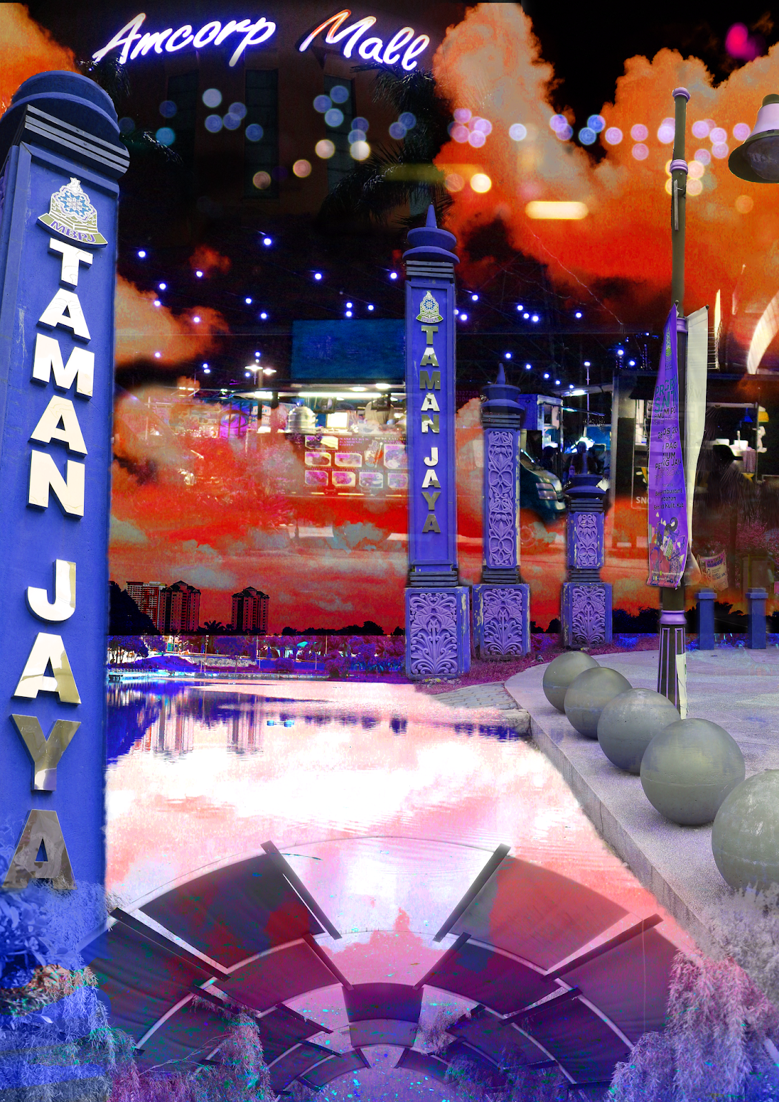 |
| Blending Mode Used |
Final Artwork:
|
| Project 2 Final Artwork - A Walk in the Park |
Here's my final artwork. I'm pleased with how it turned out as it speaks to me and my feelings about the place is actually delivered visually in this artwork. Honestly, Taman Jaya is a place that I grew up going to, and would go there at least 3 times in a month (but when I used to jog every day I would go there every day), so my view on it changed a lot as I grew up, and to me it's a familiar yet mysterious place to go to if you venture far enough, which was what I was trying to portray in my artwork.
I added the pole with the name "Taman Jaya' so that it would be clearly seen as that, but also added different parts of the place, parts that piqued my interest the most and gave me good memories. The pavement with the balls aligned in a row is actually the park entrance, where I would usually enter from to start my jogging routine there. The archway is a sign that I've almost done one round of the park and would return to the starting point. As for the lake, it's one of the main highlights of this place, and when I took it, there were clouds above reflecting on the water, it was a picturesque view. From the park, you can walk to the mall nearby called "Amcorp Mall". usually there won't be as many people there in the morning, instead loads of people fill the mall at night, which was also why I took a picture of it at night. Outside the mall, there would be food trucks every day, and I took a picture of that as well and edited it in.
As for the design principles, I focused on contrast, balance and repetition the most, I also included movement, placement and texture for it. Here's the breakdown on the design Principles used:
Contrast: The colours blue and orange are complimentary colours which contrast with each other to stand out.
Balance: The composition of the whole piece is balanced as everything fits well together and doesn't look out of place.
Repetition - There is repetition in a few elements, such as the balls on the right, the arch and the poles.
Movement - Movement is shown through the water ripples in the lake.
Texture - I added a hard light texture to the bottom part of the artwork to make the archway look like it's a magic portal to enter the place.
Placement -I put in a lot of thought about the placement of the elements and layers while working on Photoshop, and tried to make them connect to each other, if you see closely, the lake is connected to a step of the pavement with the balls, and it invites you to the actual park entrance, where I connected it to the night market and mall after that.
Feedback:
Miss Sherry said that she's always wanted to visit this mall and told me that she liked the blues that I used.
FINAL PROJECT: BILLBOARD STUDY
30/10/18 to 29/11/18 (Week 11 to Week 14)
INSTRUCTIONS:
We were to create an A3 sized artwork out of our reaction towards billboards that we observed near us for this final project.
Research:
1. Photos of Billboards for Research
During e-learning week, I went on a trip to Fraser's Hill and took pictures of signboards and directional boards instead of billboards, as I couldn't find any billboards up in Frasers!
 |
| Signboard of a Resort at the Entrance of the Resort |
 |
| Warning Signboard telling people not to park their cars |
 |
| A nice view without any signboards or billboards in sight |
 |
| Government notice board at the centre of the town of Frasers |
I realized that I wanted to know what the view of the scenery would look like if there were no signboards present, but signboards acted as information for us so I don't think taking informative signboards down would ever happen.
When I came back and had classes at university again, I took a picture of a billboard on the way back home, which was right next to Sunway Pyramid.
 |
| Billboard at Sunway Pyramid |
2. My reaction towards billboards (or signboards) and how I feel after observing them
I found out that the lesser the people, the lesser the billboards. In Fraser's, there are no advertising billboards, just signs that warn you or give instructions. For me, it's useful and helps people but it also kind of ruins the scenery / nature, but it can't be helped because the signboards are there to help people or to warn them about something.
Some signboards fit into the scenery but it's less noticeable, but if the signboards are too noticeable then it looks like an eyesore to the scenery. Maybe there could be another way to inform people about these things without ruining the scenery.
As for the billboards that I observed, I noticed that I don't even know what they want to advertise even after looking at them until they pass by my car. Are these billboards really necessary? Do they exist to increase business? Do people really look at billboards and buy the stuff after that? Or are billboards actually just 'fill'boards that fill up the 'empty space' in the city?
To me, the billboards that are currently up on the streets now cause a lot of visual pollution, and distracts the drivers while driving. This is dangerous towards everyone on the road. I think that there are better ways to advertise your stuff instead of billboards, like maybe tv ads or internet ads, and I would like to know what it's like if the city didn't have random billboards along the roads.
3. Sketches, Drawings, Mindmaps
After that, I went back and started planning on my project and decided what I wanted to do to show my reaction and thoughts about billboards.
 |
| Mindmap |
 |
| Sketches: My Objective of this Project |
 |
| Sketches: Different methods to achieve my objective and show my reaction |
I was going for either the pop-up book idea or the interactive sliding artwork idea, and due to time restrictions I ended up going for the latter idea.
 |
| Sketches: Pop Up Book Idea |
 |
| Sketches: Sliding Artwork Idea |
 |
| Sliding Artwork Mock Up ( Just the concept of it) |
 |
| Sliding Artwork Mock Up ( Just the concept of it) |
After discussing with Miss Sherry about my project, she said that both ideas were interesting and she couldn't wait to see what happens. I also showed her my mock up and after getting feedback, I realized that the artwork slider needs a place to rest at or else the second layer wouldn't know where to stop. I planned ahead and drew more sketches for the mechanics of the slider.
 |
| Sketches: Ideas about Composition and Design Principles |
 |
| Sketches: The mechanics of making the sliding artwork |
4. References
Some references that I gathered to help me with my ideas, composition, colours and art style.
 |
| Art Style and Composition Reference |
 |
| Colour Palette Reference |
1. Mechanics:
 |
| Drawing a rough sketch of my composition |
 |
| Placing the billboards so that it has enough space for the scenery art that will be hidden |
 |
| Cutting out the shape of the billboards (areas that I want to change) |
At this point I did a dumb mistake by forgetting to measure the height of the cut out area on the most left side and realizing I wouldn't have enough space to paint the hidden artwork on top so I corrected my mistake and made a new one without the leftmost billboard.
 |
| Corrected First Layer |
After that, I glued strips of the same paper to make space for the second layer to slide in and out, something like a pocket.
 |
| Gluing the paper strips to the first layer |
 |
| Completed First Layer Pocket |
After that, I cut the edges of the second layer so that it would fit the pocket, and cut a little more on the left and right sides so that I could make a stopper for the slider. (My sketches would make more sense here.) And finally I attached a black A3 card behind as the support and closing layer.
2. Draft:
I made the slider holder so that it would be easier to pull the second layer out.
 |
| Completed Sliding Pocket |
 |
| Redrawing my composition |
I drew a simple sketch to know where my stuff would be placed as I don't need to draw details when I use this watercolour technique.
3. Painting:
Here's the fun part which I took 4 hours (with meal time and toilet time included) to complete.
 |
| Painting process |
 |
| A very messy (and artistic if I do say so myself) looking rough paper |
4. Final Artwork:
I completed my final artwork, and it has two outcomes as it is interactive. Let me explain the gist of it all below.
 |
| Final Project Final Artwork: Billboards? |
 |
| Final Project Final Artwork: No, Fillboards! |
As I've mentioned in the first part
of this project, I wanted to create something that would show my reaction
towards the reason of why billboards exist and are put up on the roads. I
wanted to create a comparison of what the roads in the city or on the highway
in this country would look like with and without billboards.
As most people notice billboards only
when they're in the car, I decided to come up with a composition that shows the
perspective of the passenger next to the driver. I have two different outcomes
of this sliding artwork, as I wanted to show the difference between how it
looks when there are billboards all over the highway and compared to if the
highway was clear of billboards. When I don't pull down the second layer, the
artwork shows that there are 5 billboards, attracting your attention to all of
them with their colours and weird designs/graphics.
After pulling it down to the part
where it can't be pulled anymore, the artwork shows that there's a clear road
with trees and bushes and a sky filled with clouds (it's gonna rain soon
yehpp). Which would you prefer? I would definitely prefer the second one. I
also drew on the exposed part of the second layer when it's being pulled down
to show the rest of the car and so that it doesn't look empty and weird after
being pulled down (thanks to Miss Sherry's comment about my mock, I thought about
this and made changes to my initial idea as well).
The process was actually like this:
I would first paint the first layer, then paint the second layer which appears
on the first layer as the first layer has holes. It's something like
Photoshop's clipping mask tool, except that it's manual. I like how I used a
traditional way to present my artwork yet it still reminded me of photoshop
(the layers are haunting me :).
All in all, I had fun carrying out the final project, especially the researching part where I could freely react to the billboards and create an artwork and solution based on my reaction, and figuring out how to create my custom slider pocket (I had to sit on my chair and imagine and measure the sizes and how it would work out, but when it actually worked, I was immensely delighted). I also enjoyed presenting my idea in front of the class and hearing their opinions of whether they wanted billboards to stay or to go. I really enjoyed myself while doing this project.
Design Principles used:
Texture: I used a sponge to create texture on the road, to give it a grainy, tar feel to it. The watercolour textures also helped with softening my design, and gave the sky a light feel.
Perspective: I used a one point perspective and based everything's angle off that point.
Figure/Ground: I have a foreground, which is the car's dashboard, and the background which is everything else.
Lines, Scale: I used dashed lines to show the road's lanes, and scaled the cars, posters, streetlights based on the distance they were at for depth.
Harmony: I used colours that go well together (along the colour wheel) for the main parts of th background, and elements that fit each other, for example the barrier at the right side, the trees and the buildings after that.
Balance: In the whole composition, there was balance as nothing was standing out too much.
Placement: I thought hard and long of where and how to place my billboards so that they would look like they fitted yet captured the attention of the viewer as soon as they saw the artwork.
Repetition: Repetition is present in the barrier on the right.
Extra:
I made an animated GIF from the two outcomes of my final artwork to show the transition between when there are billboards and when there aren't billboards along the highway. I used Adobe After Effects for the transition and turned it into a GIF with Filmora Screen. I also enhanced the saturation of the photos so that it looks better on the web.
 |
| Final Artwork: Animated GIF |
I also
wanted to show a night version of the artwork and painted Glow in the Dark Gel
on specific parts of the artwork like the street lights, billboards, road, car
windows and the stuff on the dashboard but the picture didn't come out as well
because my room wasn't dark enough and the light wasn't shone enough for the
gel to keep glowing for a long time.
I wanted to express that billboards are still able to be seen at night thanks to the lights shining on them, but night driving is not as safe as daytime and drivers should focus on the road instead, which is why I tried to make the road glow as well. I will try taking another picture when it's night time and my room is fully dark.
I wanted to express that billboards are still able to be seen at night thanks to the lights shining on them, but night driving is not as safe as daytime and drivers should focus on the road instead, which is why I tried to make the road glow as well. I will try taking another picture when it's night time and my room is fully dark.
 |
| Final Artwork: Glow in the Dark |
Feedback:
I met Miss Sherry in CoDA for
feedback and advice after knowing the direction I wanted to proceed with for my
final project. She told me that both my pop-up book and sliding artwork ideas
were interesting, but I should consider the time factor. She said she couldn't
wait to see how it turns out as I had a strong idea.
After presenting my final artwork,
Miss Sherry said that the animated GIF was really cool, how it looped to show
the billboards slowly disappearing. She also said that my colours were (I
forgot the word but it has the same meaning as) dull and asked if it was on
purpose which I explained to her. She said she didn't have any other criticism
about it and liked my concept.
And that's all for Design Principles!
I'm going to really miss this class because it's the only class that allowed us
to use our hands instead of computers, and I'm going to miss my two awesome
lecturers as well (even though Miss Anis will still be teaching us during the
short sem). I'm thankful for them and this class as I got to refresh my memory
on the basics of design after taking a 5 month break before starting my degree
course.

Comments
Post a Comment