Typography - Final Project

31/10/18 - 26/11/18 (Week 10 to Week 14)
Jasmine Teoh Lee Suan (0331993)
Typography
Final Project
LECTURE NOTES:
Lecture 10: Final Project Brief
31/10/18 (Week 10)
Guidelines for the final project:
One - Print Poster
Two - Element
Issue - related to campus community
Example: No smoking, littering, lift pressing too many buttons
3 quarters of poster has to be occupied by message
Use minor geometrical elements like lines dots square - MINIMAL, RELATED TO THE MATTER
Add 1 colour other than black and white
Minor images
The messages typographically needs to stand out
Choose the right typeface
Explore possible positioning
Type expression
A3 portrait
Can be reduced in width and not height
Animate it
Using language that relates to people of your age
Lecture 11: E-learning Week
7/11/18 (Week 11)
No lectures this week as it was e-learning week.
Lecture 12: Consultation
14/11/18 (Week 12)
No lectures this week, only consultation of the final project.
Lecture 13: Consultation
21/11/18 (Week 13)
No lectures this week, only consultation of the final project.
Lecture 14: Final Submission
28/11/18 (Week 14)
Final Submission week.
INSTRUCTIONS:
Assignment Brief:
FINAL PROJECT:
I started off this project by choosing an issue that concerned the students in Taylor's University. Recently, the roads outside of the university have been really congested with cars during rush hours.
I thought of making a poster that would help spread awareness about the traffic jams outside the university at first, but after getting feedback, I realized I should have a solution to the issue in the poster as well, so I decided to focus on encouraging public transport, specifically the shuttle bus service present in Taylor's University, so that more people will take it instead of driving, which will lessen the amount of cars used and traffic congestion.
Stage 1: Gathering Visual References, Researching and Applying Elements into the Design
For inspiration on designing the poster, I started looking through the pinterest link that came in the MIB. There were a lot of cool and interesting typography posters in that link, and I chose a few posters with similar elements to study and apply the design elements used into my design, and evaluate if it was appropriate for my idea.
 |
| Figure 1.1 Visual Reference 1 |
I used the perspective playing lines for one of my attempts, to show depth and make a road for the bus. It can be seen in the Stage 3 part of this post.
 |
| Figure 1.2 Visual Reference 2 |
I got the idea to create my bus graphic using words after studying these posters.
 |
| Figure 1.3 Visual Reference 3 |
I tried to come up with better ideas for my poster after looking at how cool and strong the ideas in these posters are.
 |
| Figure 1.4 Visual Reference 4 |
 |
| Figure 1.5 Visual Reference 5 |
I noticed how the posters have a
big font size, which attracts and makes a big impact when the viewer sees it at
first glance, which made me incorporate that factor into my final poster as
well.
Stage 2: Sketches
Sketches are important when going
through the design process. I did a few sketches and wrote some notes on my
sketchbook to remember my ideas and the direction I was going for.
 |
| Figure 2.1 Sketch on Issue |
 |
| Figure 2.2 Initial sketches and notes |
 |
| Figure 2.3 Developing and rethinking about my idea |
 |
| Figure 2.4 Composition Sketches |
I sketched and attempted, then
sketched again as I had different ideas coming in as I worked on my design.
Stage 3: Attempts
Weeeeeell, I had lOAds of fun here
in this stage. :) As you can see below, these are the attempts that I made and
went through a mid-project crisis with. It's interesting to see how my first
attempt and my final attempt differ.
 |
| Figure 3.1 Compilation of attempts in my folder |
I started off with wanting to recreate the image of a bus with words. My first attempt's slogan / words for encouraging public transport (the bus) was 'Done with class? Get on the bus'. When I first completed my first attempt, I was somewhat satisfied with it because I put in a lot of effort in creating the bus but I felt like this wouldn't do. Now that I look back at it, it hurts my eyes so much.
 |
| Figure 3.2 First Attempt and Variations |
After feedback, I took out the black part at the bottom because Mr Vinod said that a poster that has a division is not a good poster.
 |
| Figure 3.3 Second Attempt and Variations |
After that, I got feedback again and was told to use another way to create the bus graphic. I used a clipping mask to mask a layer of text into a bus graphic, and emphasized on some words in the paragraph by increasing the size a little and using bold. I also tried adding headlights but it grabbed too much attention. At this part, I was really tired with my current composition but didn't know what to do about it.
 |
| Figure 3.4 Third Attempt and Variations |
I got feedback again and this time Mr Vinod told me to take all the words out and start from there again. I transcribed the elements from the posters on pinterest, but it looked too complicated and ugly, so I had the idea to make the words align with the bus instead. I also took out the 'Done with class?' part because it sounded like I wanted the students to go home right after class.
 |
| Figure 3.5 Fourth Attempt and Variations |
I tried to focus more on getting the alignment of the words and bus to look good. At this point, I was at a total loss because honestly I wouldn't want to pass this up as my final project either, I remember struggling so much at this stage of my design process that I just did whatever without thinking much.
 |
| Figure 3.6 Fifth Attempt and Variations |
I sat down in front of my computer for a long time, almost giving up with this project and deciding to pass up my previous attempt, but I didn't want to let it slide in the end. I went back to my first step and ended up finding a slogan 'Take the bus, leave your car, It's better for the environment' which I thought was way more impactful than my previous slogan. I started to get more inspiration and ideas because of that slogan. I tried out a few attempts by applying some of the elements in the typography poster examples. I think that they came out way better than my boring first few attempts.
 |
| Figure 3.7 Sixth Attempt with Different Compositions |
Photoshop became my best friend
thanks to this project.
 |
| Figure 3.8 Creating the designs on Photoshop |
Stage 4: Fixing and Fixing
As I kept asking for feedback from the lecturers, I experienced a phase where I kept fixing and fixing my designs based on their advice. Asking for feedback made me anxious and yet I kept bugging the lecturers for feedback, thanks to that, I managed to learn and understand more about idea, impact, layout, placement and alignment in a poster.
 |
| Figure 4.1 Feedback and Corrections drawn by the lecturer |
I was quite happy with this design, after trying out many attempts I decided to finally stick to this design and concept of it. From here on, I fixed the poster little by little. I had to make a decision between black or white background and I thought that the red and white would stand out more with a black background.
 |
| Figure 4.2 Seventh Attempt with Variations |
I showed this to Mr Vinod, and he gave me some suggestions. I could change the A into bus tickets since it has relation to my message. And I should try another way to express my c a r because the words dropping out of the poster didn't seem like a strong enough representation of leaving.
 |
| Figure 4.3 Eighth Attempt |
Again, after showing my design and getting feedback, I understood that the energy and direction of the poster is more focused to the bottom right corner. It looks tense (?), so I decided to make it more balanced by adjusting the position of the words. Also, my type expression was still not working.
 |
| Figure 4.4 Ninth Attempt |
 |
| Figure 4.5 Screenshot of Facebook Messages |
Stage 5: Confirmation of Poster Design
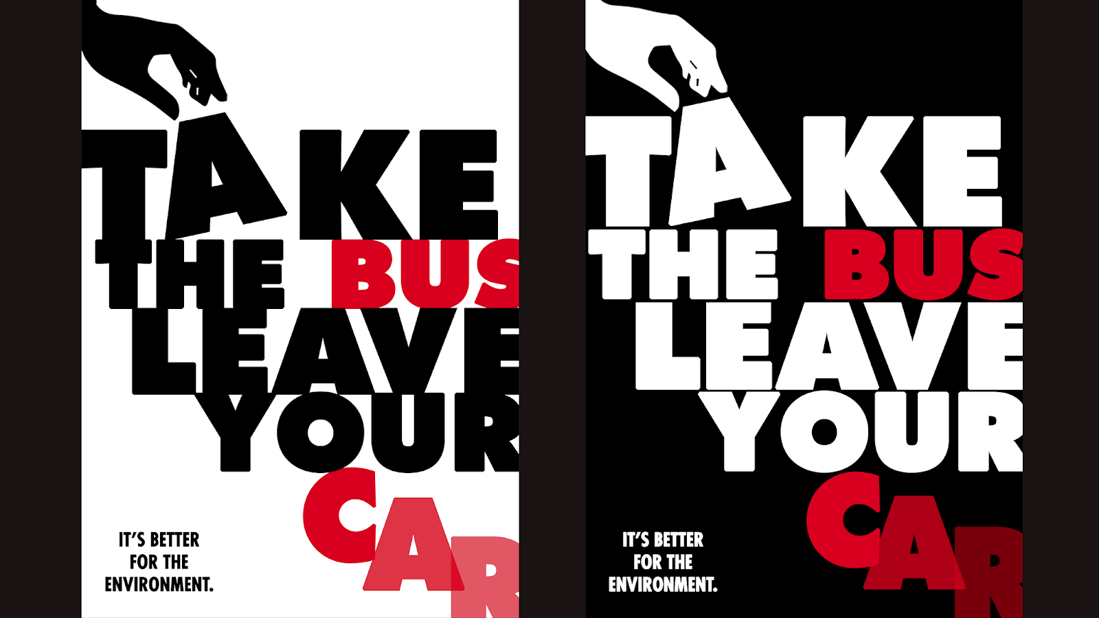
I've finally confirmed my design and plan to make no more changes to it. I think that it looked wayyyy better than my first attempt a few weeks ago, and that I know that it can still be improved, but I had to print it as Wednesday was the submission day. I also think that this design has satisfied me more than the previous ones and I think it leaves a stronger impact as a poster.
 |
| Figure 5.1 Final Poster Design |
Stage 6: Animating
After the design was finalized, I started on my animation on Photoshop.
These are the amount of frames that I made to come up with my final animation gif poster.
 |
| Figure 6.1 Animation Frames |
 |
| Figure 6.2 Animating on Photoshop Timeline |
Here are the results of my GIF Poster:
The first attempt I made, it was really minimal, with 11 frames and I just showed minimal movie action of the hand taking the tickets and the car leaving through the exit door.
 |
| Figure 6.3 GIF 1st Attempt |
For my second attempt, I made the animation loop by retracing back on the layers. I felt like it was awkward though, so I decided to work on it more.
 |
| Figure 6.4 GIF 2nd Attempt |
Finally, this had a clearer animation of my message, with 45 frames I made the hand take the bus tickets out of the word 'take' and made the car leave through the exit door, with the tiny man on the exit door sign leaving as well, and landing in the middle of the letter C like it was a car.
 |
| Figure 6.5 Final Animated Poster GIF |
I got feedback from Mr Shamsul that I could improve my animated GIF by making the motion faster, so I tried it out right after hearing that. Here's the outcome:
 |
| Figure 6.6 Final Animated Poster Updated |
Stage 7: Printing and Framing Poster
I printed my poster out as well in A3 size, but it had small white border around it, but that didn't really affect my design. I used Finland Ivory 180gsm as the paper. I also got a black frame (40x50) at IKEA and mounted my poster onto the frame with double sided tape, only on the top portion as it would cause the poster to puff up in the middle if i did it on the bottom as well.
Here's my poster in its frame:
 |
| Figure 6.6 Printed Version of Poster |
FEEDBACK:
Week 10:
I asked Mr Shamsul about my poster
and asked for confirmation if the traffic jam issue right outside campus could
be done and he said any issue that affects us in the campus could be worked on.
Week 11:
There were no lectures and
feedback given this week as it was e-learning week.
Week 12:
Mr Vinod said that I should know what the message I want to convey
to the public is first before thinking about anything else. I told them that my
issue was about the traffic jam outside of Taylor's University and they
suggested that I try to create a poster to encourage public transport. They
advised me to look for already made up slogans online.
General Feedback: Mr Vinod had a talk with
the class and told us to work harder for our final project, reminding us how a
design process should be like and how we go too fast to the computer when we
should be sketching our ideas on paper first.
Online Feedback: I sent my poster design to Mr Vinod and Mr Shamsul, and it is
currently in the process of being reviewed by Mr Vinod, while Mr Shamsul has
viewed it and gave a thumbs up to my message on Messenger.
Update on my first attempt: When you make a division at the bottom like that, it decides the
poster into two different parts. That’s is not a good poster. Then the crafting
to the bus using the text is a little crude esp around the edges.
Week 13:
In class, Mr Vinod advised me to mask the bus and get the graphics
correct first before adding on the words. He told me to take all the words in
my poster out and focus on the bus graphic first.
Online Feedback:
2nd attempt: Check the spacing and delete the Taylor’s logo for now.
3rd attempt (about the
disintegrating pixels):
What’s that mean?
4th attempt: It has impact. What if the A is a bus ticket The impact is good but
the idea is slightly lacking Like I don’t understand why the c-a-r is like
falling... doesn’t convey ‘leave’
5th attempt: You’re pushing the text too much to the corner.
To much energy focused there. Also, the type expression with the car is not
really good. The A/ticket is working well in this case.
Week 14:
Submission week.
REFLECTION
Experiences:
Week 10: I felt excited yet nervous for this project, excited
because we could finally design something big and cool like a poster, nervous
because it's the final project and I hope I would be able to create a good
outcome at the end of this project. I also felt relieved as my previous project
was completed without me having to worry about it.
Week 11: I felt like I slacked off a lot during this week as I went
on vacation with my family to Fraser's Hill (it was e-learning week). I relaxed
a lot and took my sketchbook out to work on my ideas but ended up not being
able to work well as it was super cold up there.
Week 12: I felt the pressure coming in as I started on my designs
this week, I worked harder to replace what I didn't do last week and ended up
being tired at looking at the computer screen for so long. I also felt troubled
as I didn't know how to continue my design for a few days, and decided to ask
some people around me for feedback.
 |
| Figure 8.1 Asking for feedback from friends |
Week 13: I felt so stressed in this week because my final poster design was still not finalized and I still wasn't satisfied with it, neither were the lecturers. I kept asking for feedback on messenger since there wouldn't be any class anymore. I used most of my nights to keep trying out different approaches to it and I felt like giving up but I just kept pushing myself, I experienced something that I've never done so before in my life.
Observations:
Week 10: I noticed that there were
a lot of issues going around in campus, and a lot of people were choosing
environment related issues. I also noticed that many people have already
started on their posters without sketching designs first.
Week 11: I noticed that my mind is
too relaxed when I don't have classes, and I tend to be not disciplined about
my work when I'm on holiday. I notice that I enjoy my life when I'm supposed to
enjoy it, and cry later.
Week 12: I noticed that many of my
classmates were asking for feedback from my lecturers, like everyone needed to
get approval for their designs. I followed suit as well. I also noticed myself
in a crisis and knew that I needed to work extra hard.
Week 13: I noticed there are
different types of paper to print posters and the quality of the papers are
different, with the outcome of the posters being different as well. Some
materials do not go well with black as the black will have some blotches on it,
whereas some papers will show a really clear black.
Findings:
Week 10: I realized that sketching
designs is really important in big projects. It shows the process of design and
helps remind us where we started off and how we got there eventually. I
realized that planning also takes a lot of time but it is worth it instead of
just going for the digital before planning out everything properly.
Week 11: I found out that holidays
are a good time to rest from classes and decided to let myself recharge.
Week 12: I realized that I needed
to work consistently if I didn't want to stress out in the future. I also
realized and understood that our lecturers just want the best for us when they
give us feedback and let us know where we stand. I realized that I should keep
asking for feedback because it's my right as a student to do so, but I also
understand that the replies won't be as fast as the lecturers have so many
other students to reply to, and have work to do on top of that as well.
Week 13: I realized that I
shouldn't be scared to ask for feedback, and treat my lecturers as friends
instead. I also realized that I had to stop limiting myself to just one
possibility and keep doing my best to try out new possibilities. I also
realized that I kind of broke free from my first idea and it turned out better
than what I first did, which made me feel something deep down in my heart. I
definitely realized that I have improved a little bit since I first started but
I should keep striving to do my best and not give up.
FURTHER READING:
1. Combining Typefaces by Tim Brown
7/11/18 - 14/11/18 (Week 11)
I was deciding on what typeface to use for my poster at this point of the final project, as I've just started working on it. I found this e-book, and decided to read it before I've decided finally on which typeface to use (well while reading the book I was also working on my project so I used different typefaces at first).
From this book, I understand that most people advise to stick to one typefamily or choose typefaces from the same designer, and I think that actually makes sense because it would look so weird (I finally realized this yes) if you just combined different kinds of typefaces for no apparent reason.
 |
| Figure 9.1 Choosing an anchor typeface |
 |
| Figure 9.2 Critique Typefaces |
 |
| Figure 9.3 Advice from others |
Here's the whole version of the e-book so that everyone can read it:
2. Typography Crash Course by Denise Bosler
14/11/18 - 21/11/18 (Week 12)
I was stuck with my final project this week, and I just wanted to refresh my brain with a recap of what Typography is, so I found this short book and decided to read it.
Some parts of it were about web typography and coding though. But the part about brushing up on the history of typography took me back to the first few classes we had and gave me motivation to continue my final project as I have worked hard this far into the semester already.
I also got to recap on the kerning and leading that I used in my final poster's words. I also tried to use web appropriate fonts in my poster as how the book mentioned, as my poster would be distributed on the web.
 |
| Figure 9.4 Kerning and Leading |
 |
| Figure 9.5 Using Web Appropriate Fonts |
Here's the whole version of the e-book so that everyone can read it:

Comments
Post a Comment