Typography - Project 2

25/10/18 - 31/10/18 (Week 9 to Week 10)
Jasmine Teoh Lee Suan
Typography
Project 2
LECTURE NOTES
Lecture 9:
25/10/18 (Week 9)
We did not have any lecture today and were briefed about our second project instead. We used the rest of the class to learn about how to create font, sketch ideas for our font and shape it out digitally on Adobe Illustrator.
We did not have any lecture today and were briefed about our second project instead. We used the rest of the class to learn about how to create font, sketch ideas for our font and shape it out digitally on Adobe Illustrator.
Lecture 10: FontLab Briefing
31/10/18 (Week 10)
We were taught how to use FontLab to create our fonts so that they could be used and typed out in different softwares in our computers.
Fontlab Brief:
- start a new file, see character map all letters required to create a typeface
- basic punctuation marks and symbols should
File > Font Info > Metrics and Dimensions > Key Dimensions (Set parameters of the font, names, copyright etc)
Go to letter R > copy and paste vector artwork from AI to FontLab that window > zoom in (z) zoom out (x)
Side bearings (to adjust space between two letters)
Open new metrics window - can type the letters that you've designed - can adjust the left and right bearings there - adjust kerning for your font
INSTRUCTIONS
Assignment Brief:
PROJECT 2
Week 9 (25/10/18) to Week 10 (31/10/18)
At the start of the project, we were given an exercise to know what we were supposed to focus on for this project. We highlighted that the x-height should be 500 pt and the x-height for capitals should be 700 pt when creating our font. Then we selected a font and letter and had to draw circles and lines on Adobe Illustrator to define the shape and form of the selected letter. I chose J because my name starts with the letter J.
 |
| Figure 1.1 Circles and Lines of Letter on Adobe Illustrator |
For project 2, we were to create a new font, but only minimal letters of that font (our initials) by ourselves, referencing and basing it upon the 9 fonts that have been given to us by our lecturer. I started to observe the fonts. I decided to refer to Serifa and incorporated the serifs from it into my font. I sketched my font ideas out on a sketchbook and added little details to the fonts. I decided to give the edges of my font a little curve to it. I also took note of the weight and the width of the fonts, some fonts (like the letter S) have different widths at different parts of the letter.
 |
| Figure 1.2 Sketch of my Font Designing Process |
I then transferred the sketches to Adobe Illustrator after showing it to the lecturers, using the pen tool, shape tool, smooth tool and direct selection tool. I created shapes and reused them in the areas that were identical in the other fonts.
I had a bit of a struggle trying to keep all three letters in the same weight as the weight of the letter S was not easy to modify. The S in my first attempt looked lighter in weight and it wasn't curved well, while the top horizontal stroke of T looked too heavy.
 |
| Figure 1.3 Font Design Attempt 1 |
After hours of trying and redoing, smoothing the letter S with the smooth tool and using the direct selection tool to change the form of the letter S until it looks pleasing and has the same weight as the other letters, I was finally satisfied with my three letters and and showed it to the lecturers for approval. I then decided to print it.
 |
| Figure 1.4 Complete Set of My Initials |
Here's the breakdown of my font shapes.
 |
| Figure 1.5 Forming of Letter T |
 |
| Figure 1.6 Forming of Letter L |
 |
| Figure 1.7 Forming of Letter S |
Here's my final compilation of Project 2, Font Design:
 |
| Figure 1.8 Compilation Page of Exercise, Sketch and Final Outcome |
 |
| Figure 1.9 Final Outcome |
I printed the final compilation out in A4 paper after I was done with everything.
We were also told to create our font on FontLab as an OpenType (ttf) file.
I moved my vector artwork from Adobe Illustrator to the Glyphs window in FontLab for the respected fonts and adjusted them. I decided to name my font STeLLar.
 |
| Figure 1.10 FontLab Window |
 |
| Figure 1.11 T Glyph Window |
 |
| Figure 1.12 L Glyph Window |
 |
| Figure 1.13 S Glyph Window |
I had a problem with exporting and creating my font on FontLab in my computer as it was the demo version. I don't know why the words came out weird when I tried to type it out.
 |
| Figure 1.14 Font Test in Adobe Illustrator |
I finally went to the computer lab in the university to generate my font using the full version of FontLab 5 and this is how it looks like on Illustrator.
 |
| Figure 1.15 Font Test in Adobe Illustrator (Success) |
FEEDBACK
Week 9:
Font Design: Mr Vinod commented on the letter S in my font design and said that it should have the same weight as the T and L, the width might be the same when measured but it looked lighter than the other two letters when you look at it visually. He also commented that the letter T should have a longer horizontal stroke that has the same thickness as the top of the letter S, as the letter S has different thicknesses at different parts of the letter for some typefaces.
Week 10:
I was done with my font design as it was approved last week so I didn't dwell on the project anymore and started planning what I had to do for the final project instead.
REFLECTION
Experiences:
Week 9: I felt confused at first because I didn't know what the circles and lines were for in creating guidelines for the structure. I had fun drawing them after awhile though, and I could see the minute details in the typeface I chose because I had to zoom in and focus on the shape of the letter.
Week 10: I felt productive as I have created my own font with its own style by basing it on an already made typeface.
Observations:
Week 9: I noticed that not all the strokes of each letter in the typeface has equal width and it affects the whole letter in general. Once I've done the exercise, I noticed the little differences that appear in a letter that we usually do not pay attention to.
Week 10: I noticed that if I work hard and ask for feedback with my own responses and ideas proving that I have thought about my project, I would have an easier life in the following week.I also noticed that getting feedback early on in the class is a good thing.
Findings:
Week 9: I realized that there are many little things that make up a font, and that each font is special as it is made individually one by one by the font creators. I also realized that planning and sketching is important in designing as it helps you know what you want to achieve at the end.
Week 10: I realized that if you export a png file and place it into adobe illustrator, it will look blur compared to if you place the original AI file into another AI file which will make it look way clearer. I also realized that having a border for your compilation of work for an exercise (like Figure 1.8) makes it neater and more professional.
FURTHER READING
1. Type Classification Handbook by Jacob Cass (https://justcreative.com/)
25/10/18 - 31/10/18 (Week 9)
I found this e-book on online on a free e-books website. I decided to choose this to read this week because I was creating a font this week and I thought I could learn a little from this book. This book is all about typefaces and how they create font specimen sheets, with some examples of it. I understood that every font creation process is intricate and requires a lot of detail and attention to it. I also understood that all outcomes of font creation are different but the process to create them are similar.
 |
| Figure 2.1 Type Classification Layout Guide |
 |
| Figure 2.2 Font Specimen Sheet |
I particularly like these two typefaces and the specimen sheet shown from the book, Humanist and of course, the oh-so-popular Times New Roman.
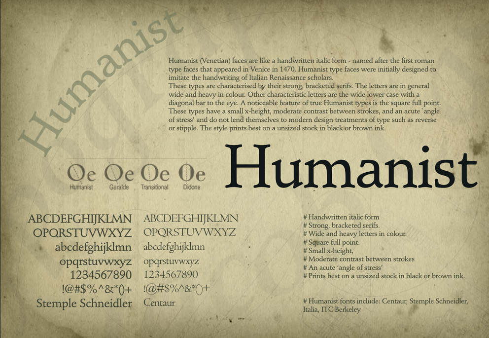 |
| Figure 2.3 Humanist Font Specimen Sheet |
 |
| Figure 2.3 Times New Roman Font Specimen Sheet |
Here's the whole version of the e-book for everyone to read:

Comments
Post a Comment